Data visualization
Quoting Edward Tufte: “Data graphics visually display measured quantities by
means of the combined use of points, lines, a coordinate system, numbers, symbols, words, shading,
and
color.” Data visualization is about representing graphically a set of data, which can be text,
number,
media, sound, etc. However, as Johana Drucker suggests, data (from Latin datum, given) are
capta,
entities that are taken. When creating a dataset to visualize, someone decides what kind of query pose
to collect specific information: this means that data are never neutral.
The
The Visual Display of Quantitative Information, Edward Tufte, 2001 ↗
The
Graphesis, Johana Drucker, 2014 ↗
As a Data Visualisation designer, my main task is to deliver information through visual models. Depending on the typology of data and audience, I can design bespoke interactive or static graphs, charts, maps, databases, and dashboards, respecting accessibility guidelines and best practices.
Services:
• Research
• Data cleansing and analysis
• Mapping
• Prototypes
• Printed and digital reports
• Scrollytelling
• Tailored courses
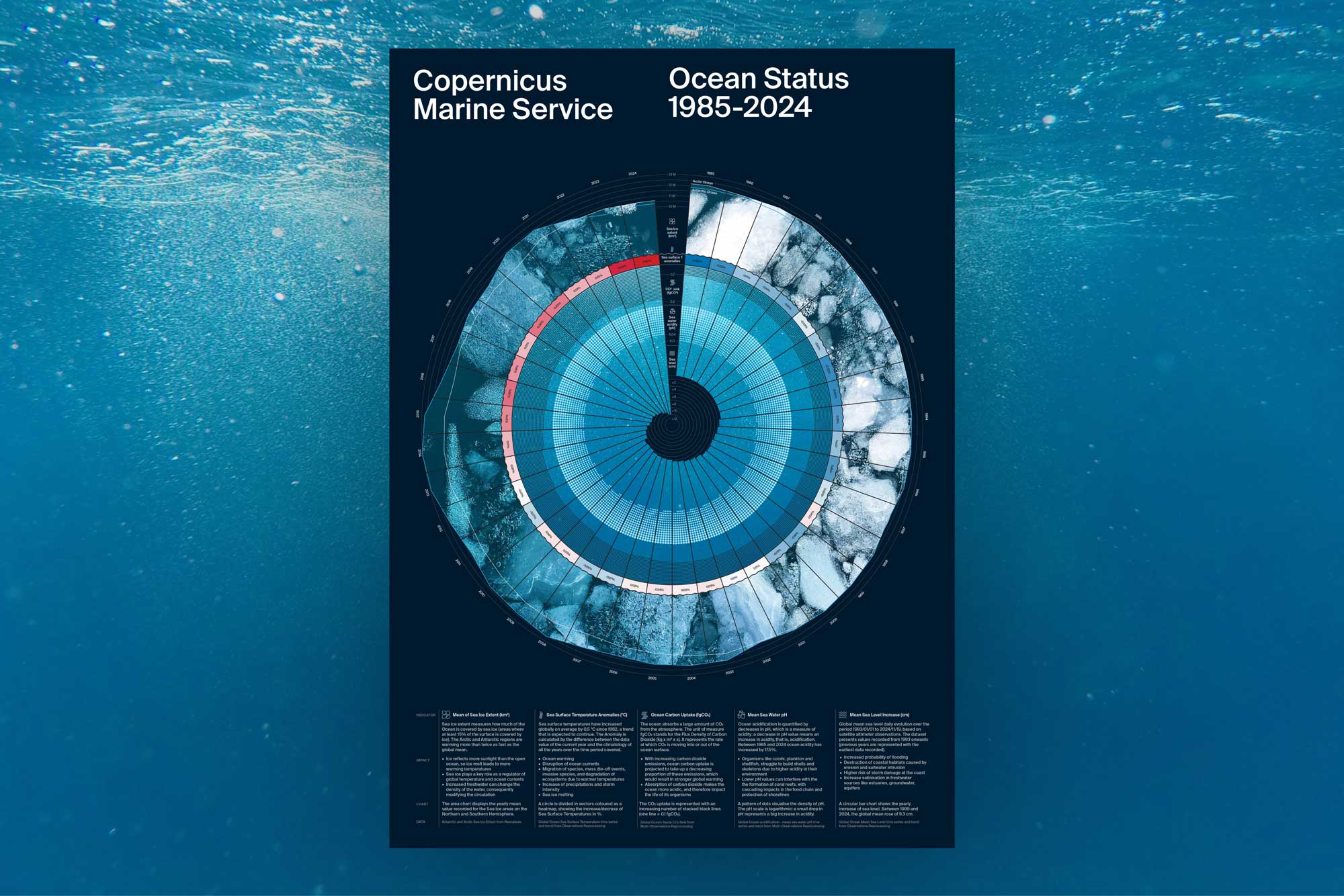
Ocean Status 1985-2024
Ocean Status is a circular calendar visualizing 40 years of ocean observations through five
Copernicus Marine Service indicators: Sea Ice Extent, Sea Surface Temperature Anomalies, Ocean
Carbon Uptake, Seawater pH, and Mean Sea Level Increase. Each indicator is plotted on a radial slice
of the circle, together composing 40 years of recorded observations. The chart is designed to reveal
the differences between historical and recent ocean conditions, allowing the design to scale easily
as new years of data become available.
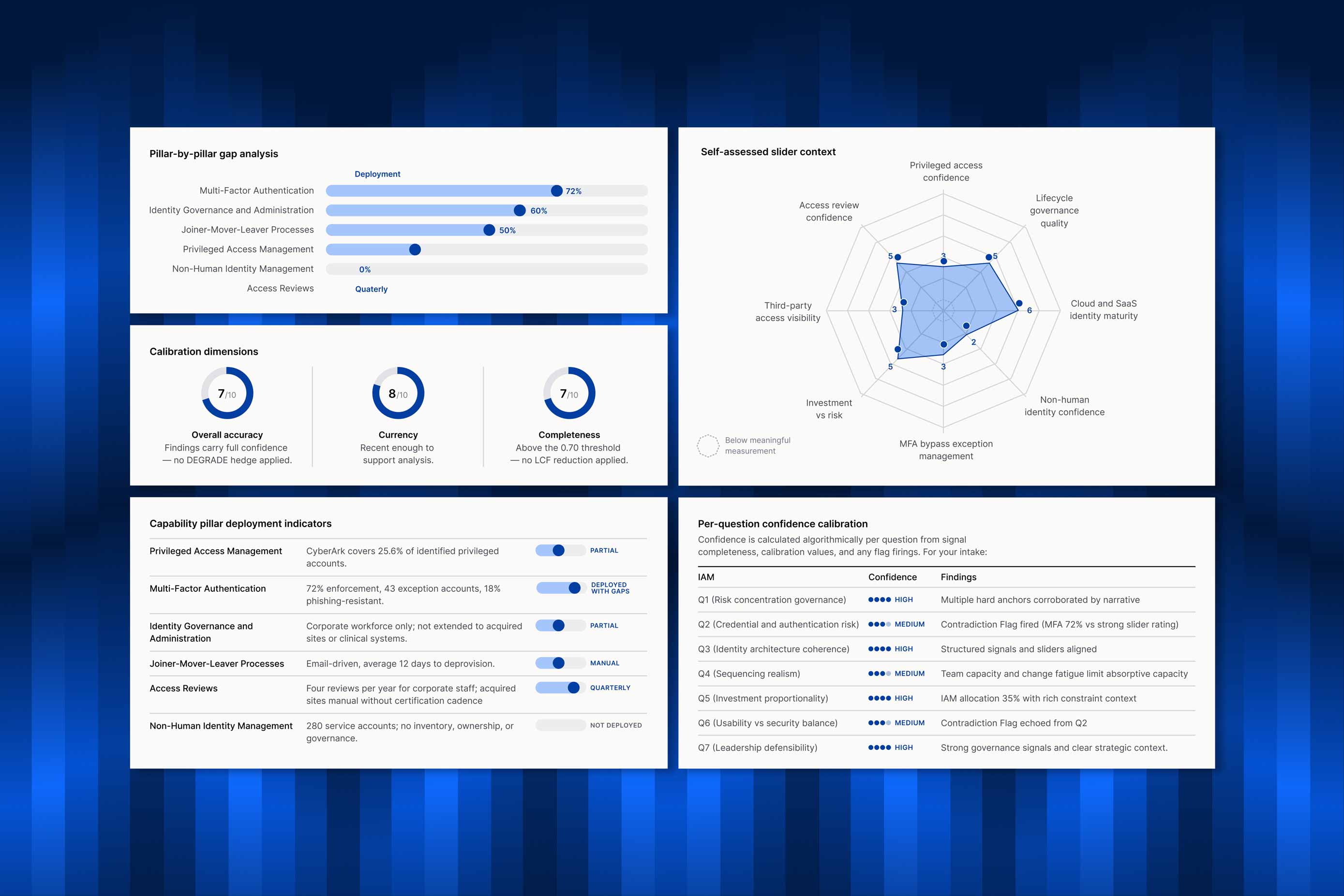
AI-generated report design
Vantis Decision Intelligence produces structured cybersecurity strategy assessments for senior
security leaders. Every client organisation receives a 30-page assessment report with various data
and charts that render conditionally.
The report layout, based on the Vantis brand identity, has been designed in Figma to facilitate the
final generation via coding.
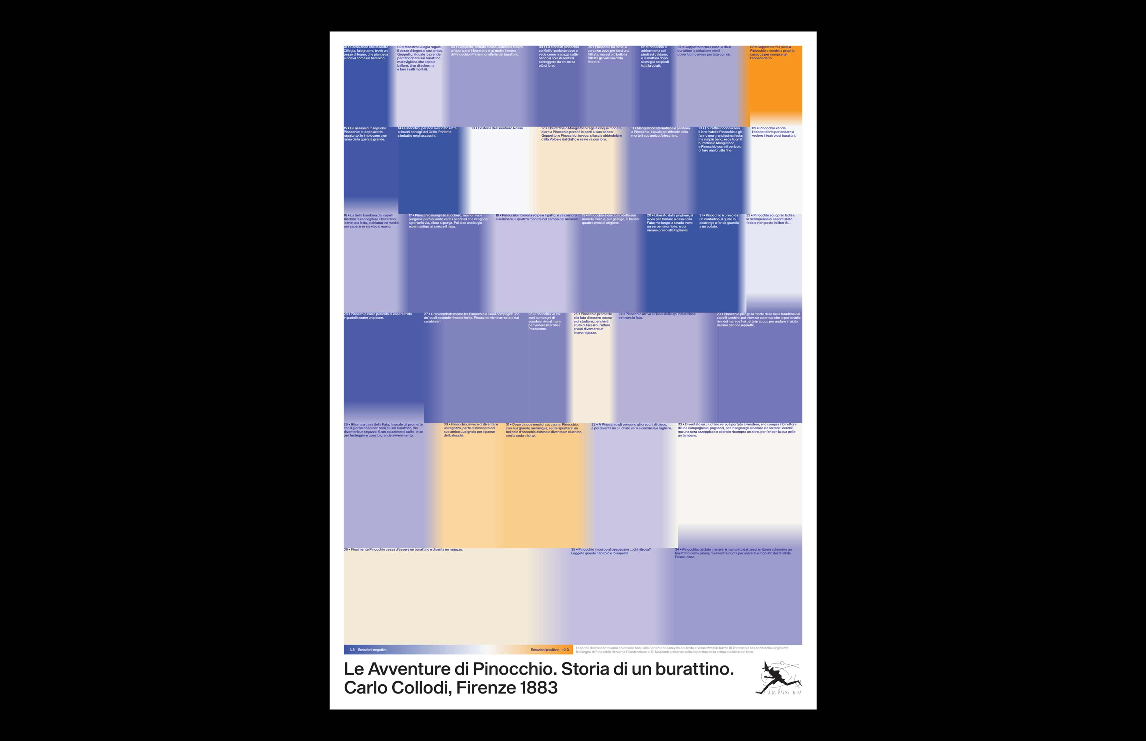
Reading Pinocchio
The poster offers a critical reading of Carlo Collodi's book “The Adventures of Pinocchio. Story of
a puppet", through a sentiment analysis of the text. Published in 1883, the original story is much
richer than the various cinematic adaptations.
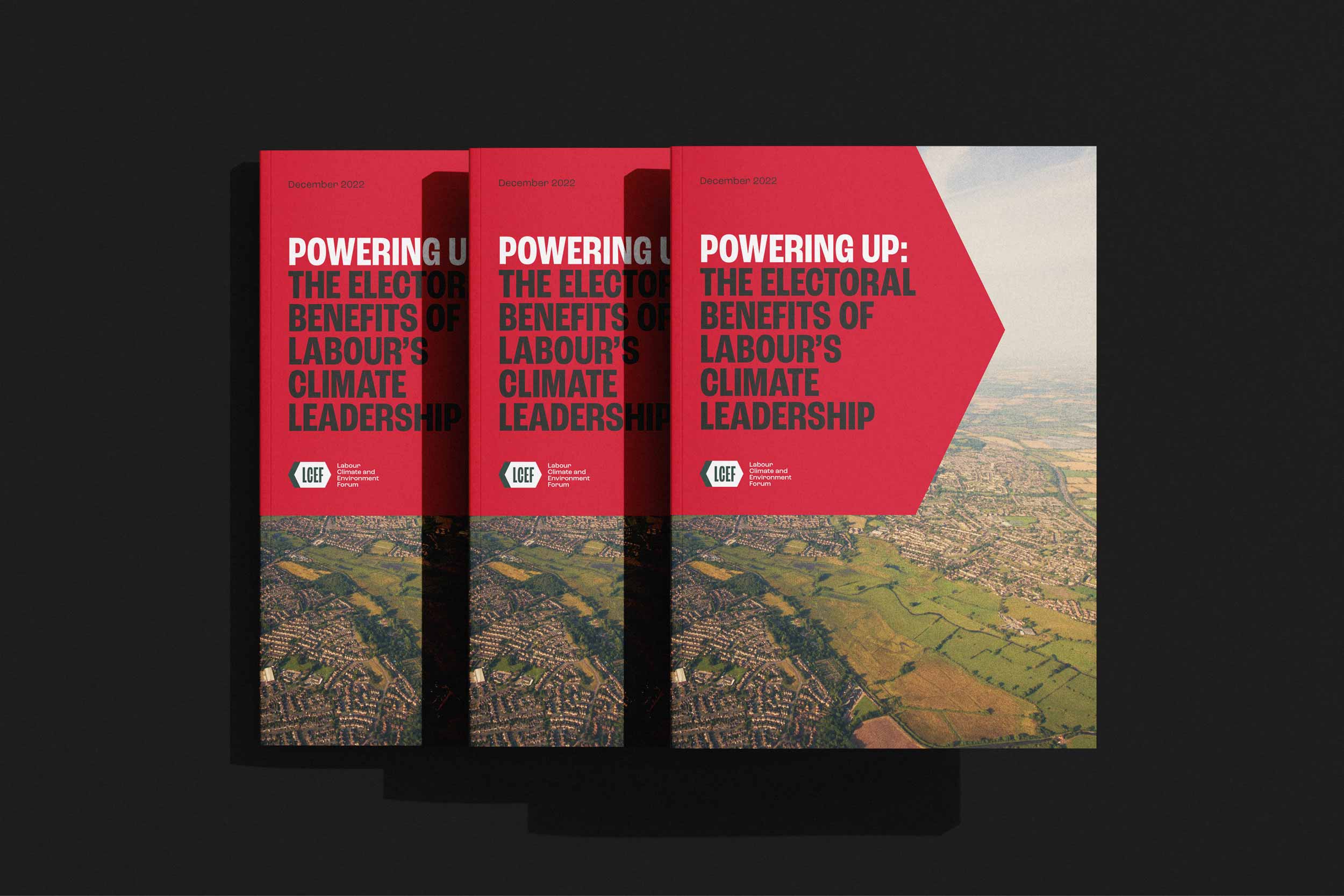
Report design for the Labour Climate and Environment Forum
The Labour Climate and Environment Forum (LCEF) is an independent UK-based organisation and lobby
group dedicated to strengthening climate and environmental ambition across the labour movement.
The report features several survey data. The polling research shows Labour politicians talking about
climate
change and environment has a positive influence of said politicians and the party brand.
Know more ↗
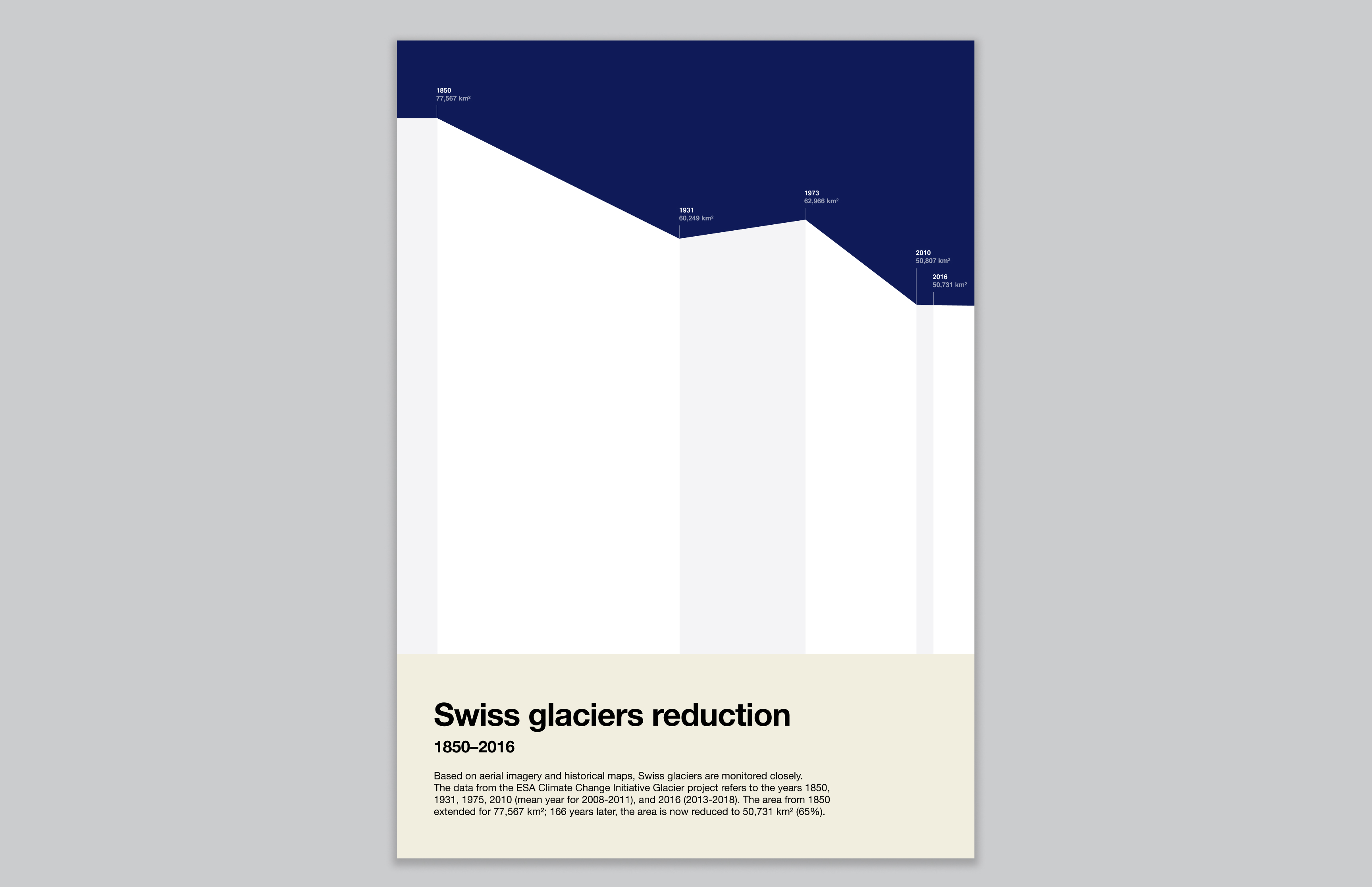
ESA Little Pictures: selected data visualization
Little Pictures are data-driven images that distill complex science and prompt climate action by
using satellite-derived climate data records from the European Space Agency, EUMETSAT and reanalyses
from ECWMF Copernicus Climate Change Service. This Little Picture illustrates the reduction of a few
glaciers in south-west Switzerland (specifically, the area that spans from the Theodul to the
Mellichgletscher glaciers). The Area Chart is designed to resemble a mountain skyline, with the
height shifting based on extension of the glacier over time.
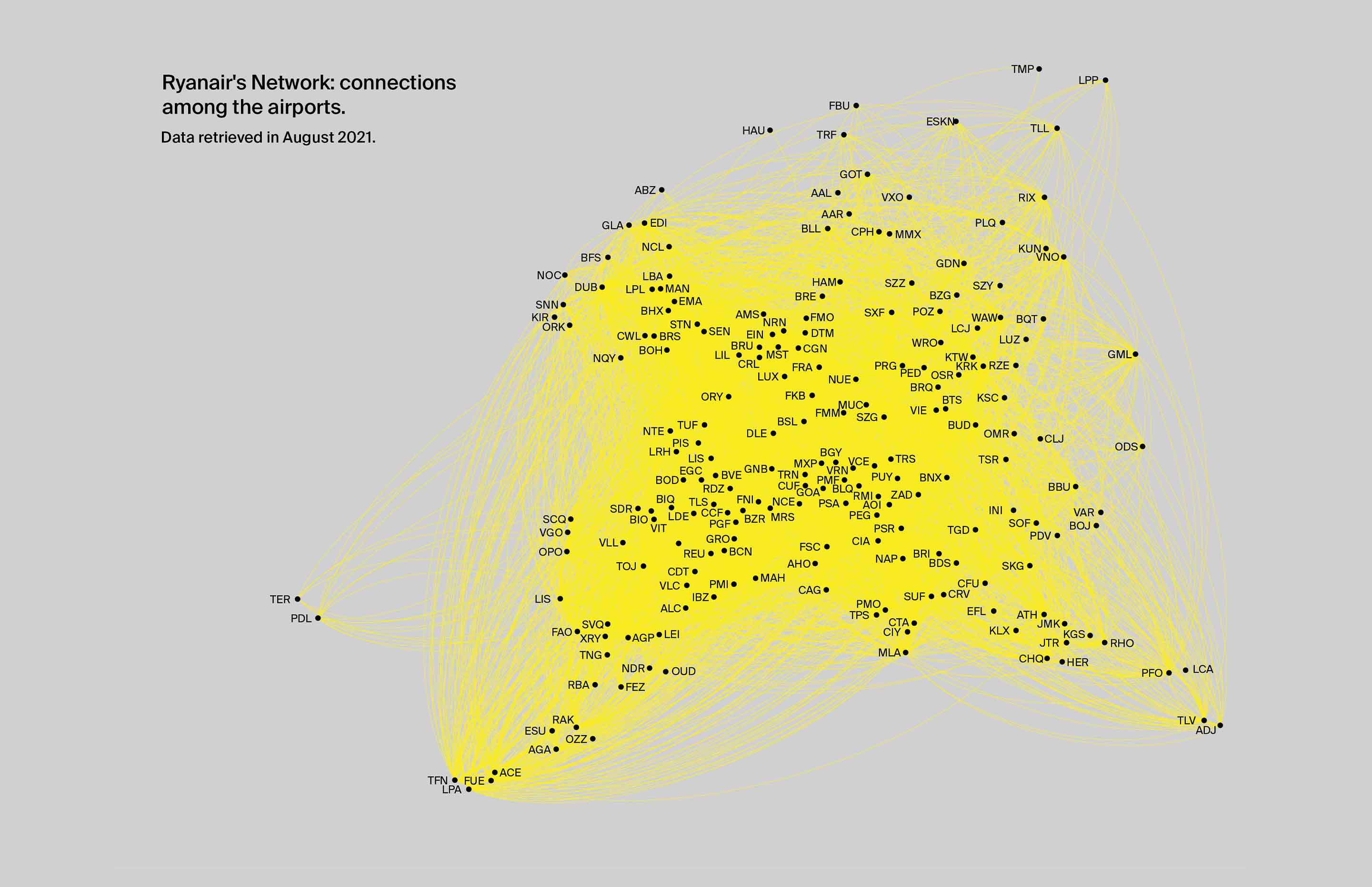
GEO–DESIGN: Budget Arlines
GEO–DESIGN is an exhibition platform that explores the social, economic,
territorial,
and geopolitical forces shaping design today. The focus of this fifth chapter
was on business of low-cost airlines, specifically Ryanair.
The exhibition identity shows the scale of the air carrier by creating a visualization of Ryanair’s
network.
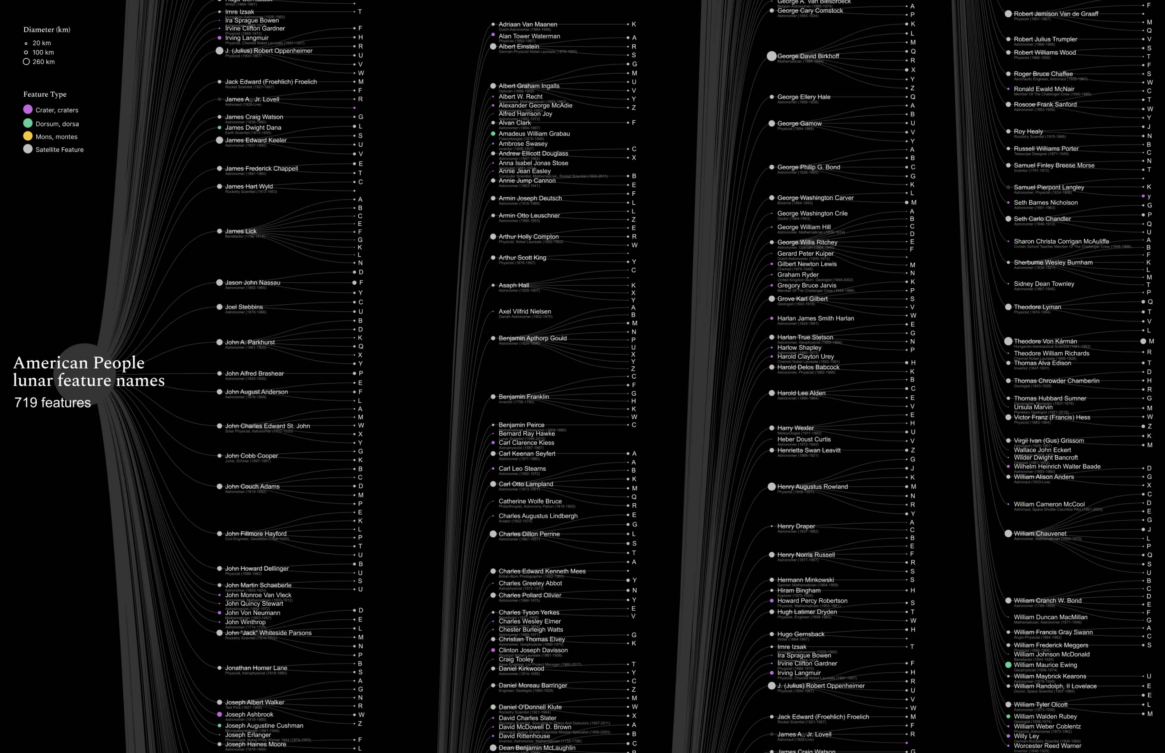
The Names on the Moon
The project investigates the nomenclature system of the Moon, and question
the process applied to identify the unknown. Why are craters, mountain ranges, and valleys named
like places existing on Earth? Or are lunar features identified with the names of scientists,
researchers, and philosophers? The surface of the Moon is reinterpreted with charts and maps,
offering a new portray of our closest natural satellite.
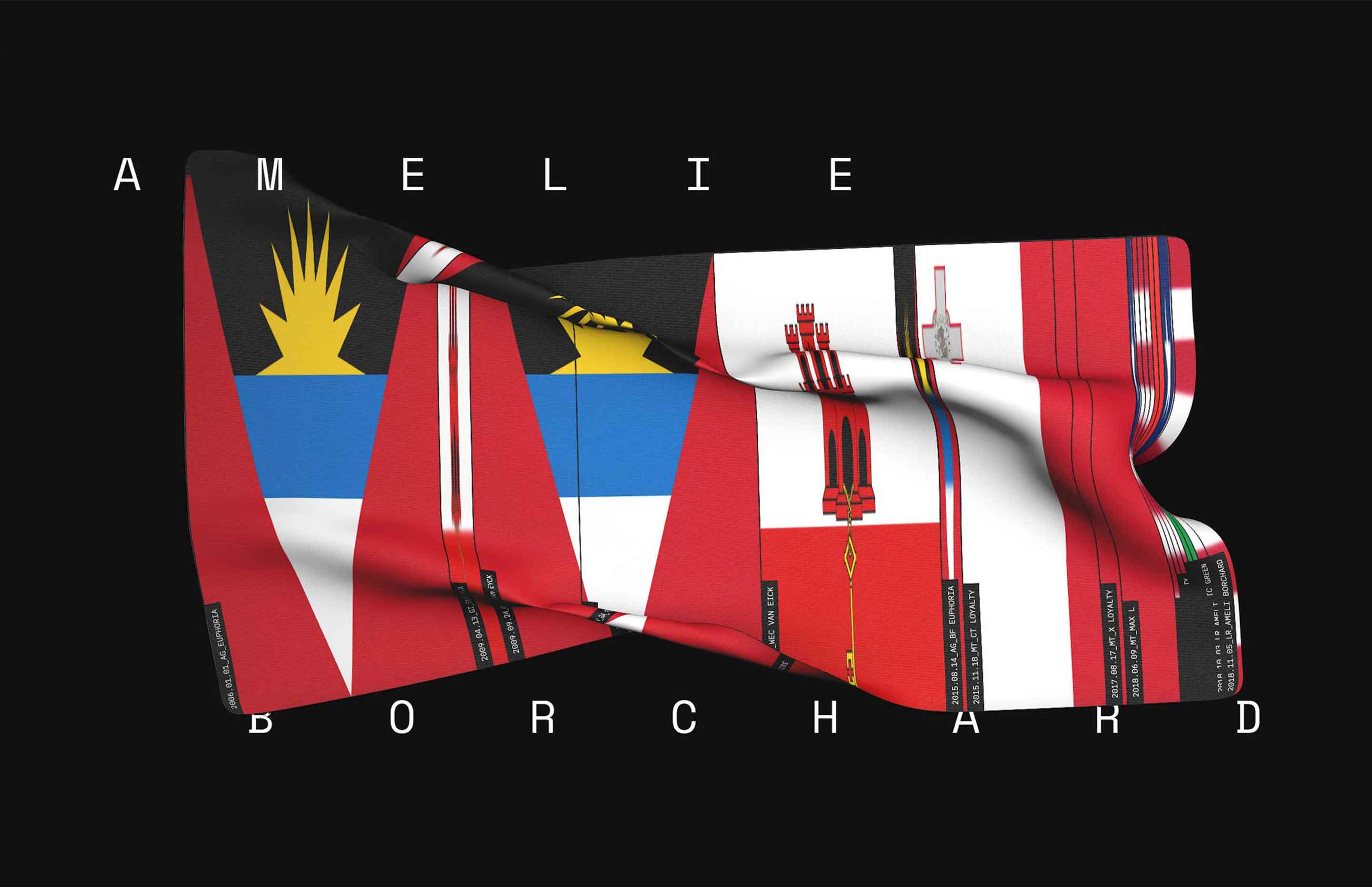
EX-NAMES
Ex-Names aims to make more visible a common practice among vessel owners: the change of name
and register. Here are presented 10 vessels that changed identity very often in recent years: their
past identities are reconstructed by creating a flag of flags.
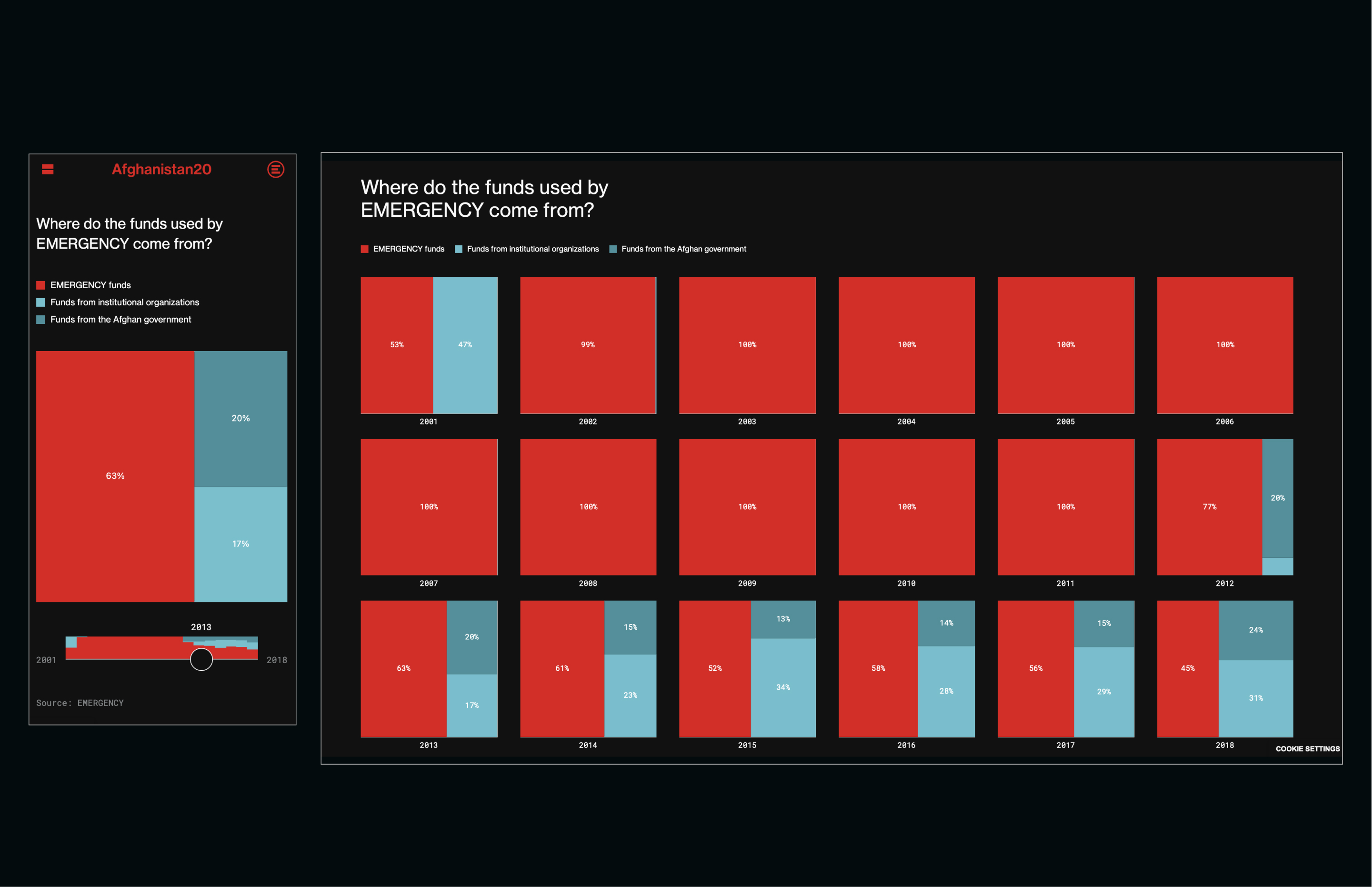
Afghanistan20 / Accurat studio
Afghanistan20 is an online project developed for the Italian NGO EMERGENCY: it reflects on the 20
(and counting) years of war in Afghanistan from the perspective of its victims and those doctors and
volunteers who help them. The detailed report is enriched by
intense photographs and interactive data visualizations.
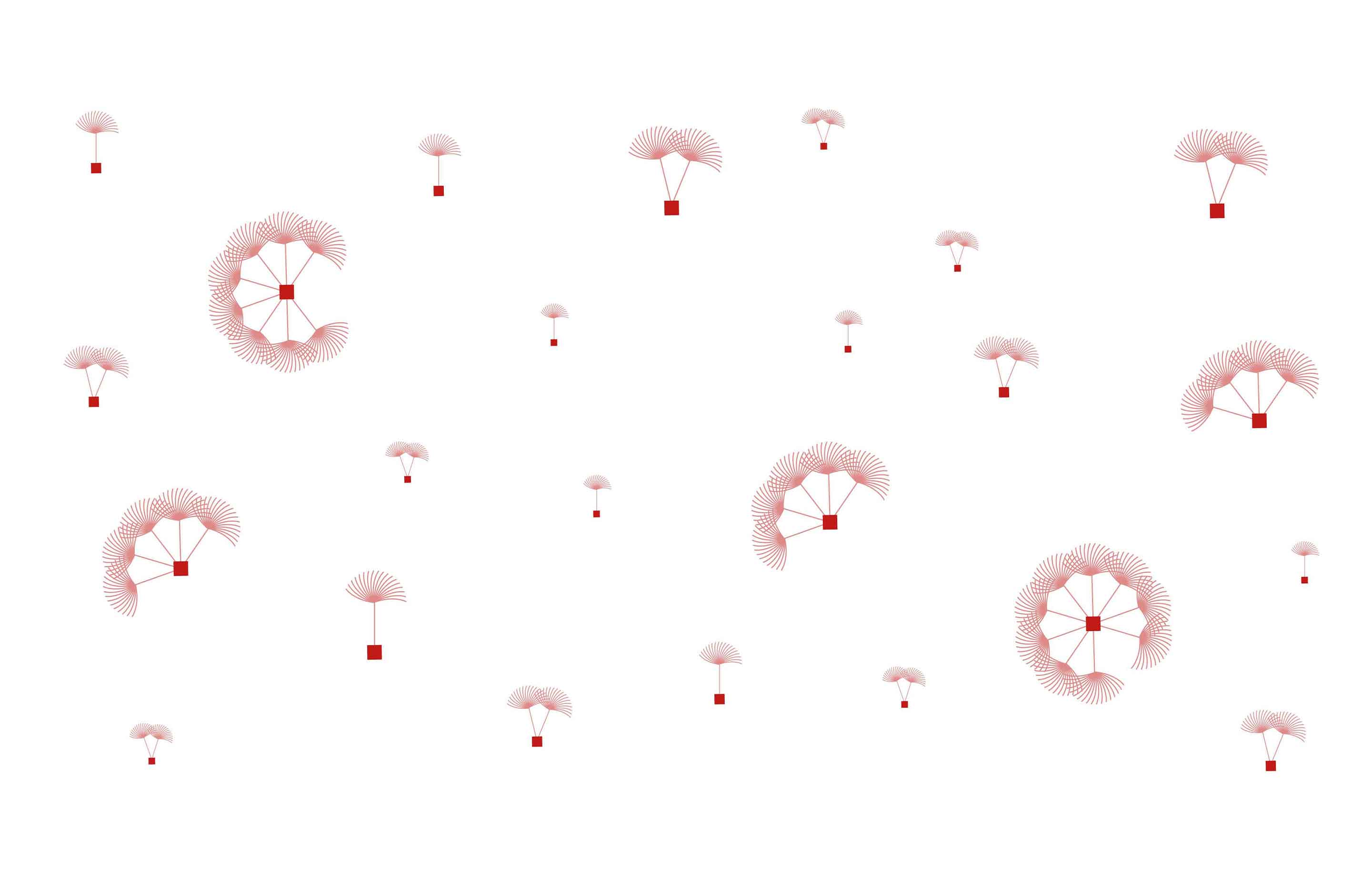
Dandelion
The data visualization video pictures 226 keywords expressed by Generali A&WM People who have
answered to the
question 'What does Digital represent to you?'. Like a dandelion flower, each keyword is transformed
into a seed free to spread new ideas and
paradigms.