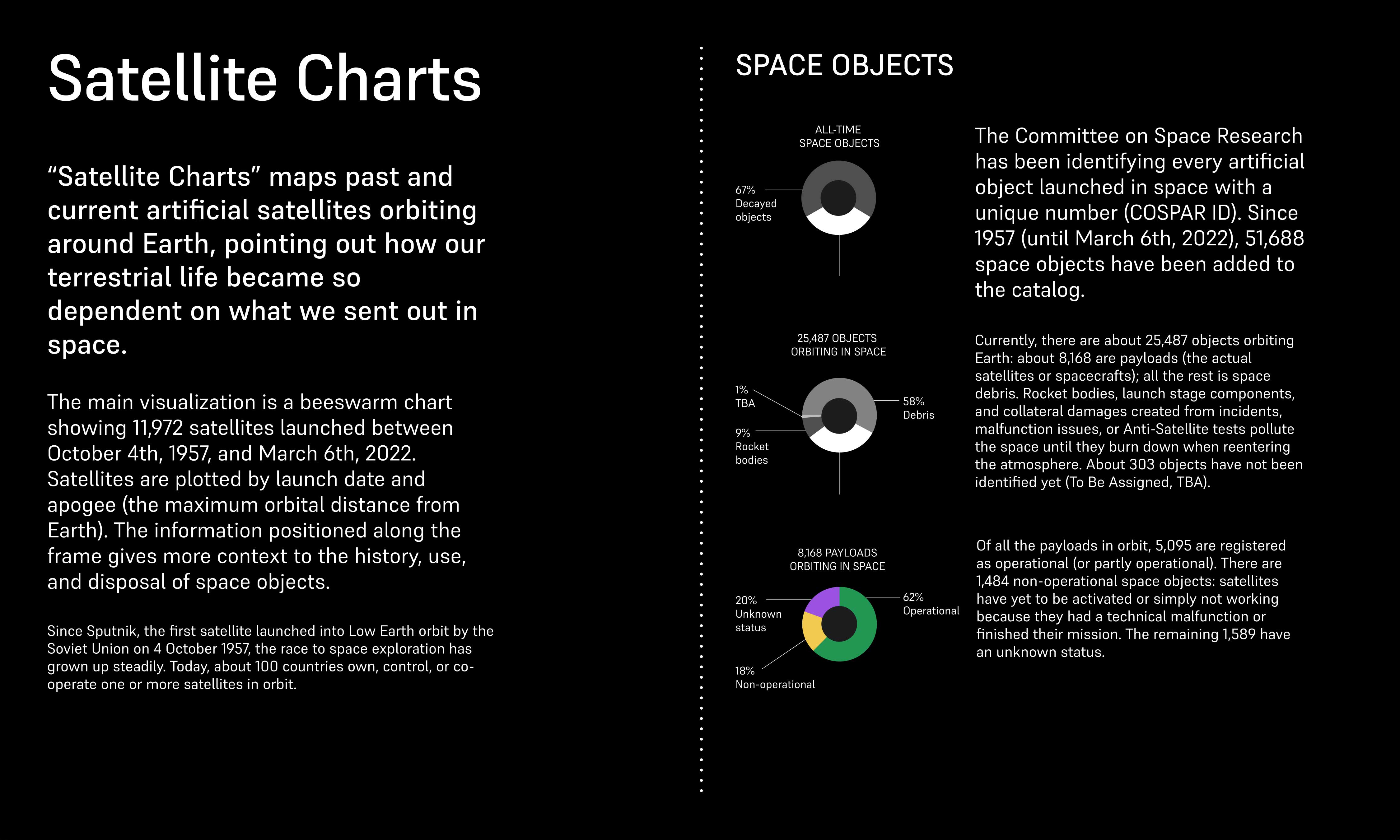
Satellite Charts
“Satellites Charts” examines current and past artificial satellites orbiting around
Earth, pointing out how our terrestrial life became so dependent on what we sent out in space. With
topics ranging from space exploration to space pollution, communication, and warfare, the data
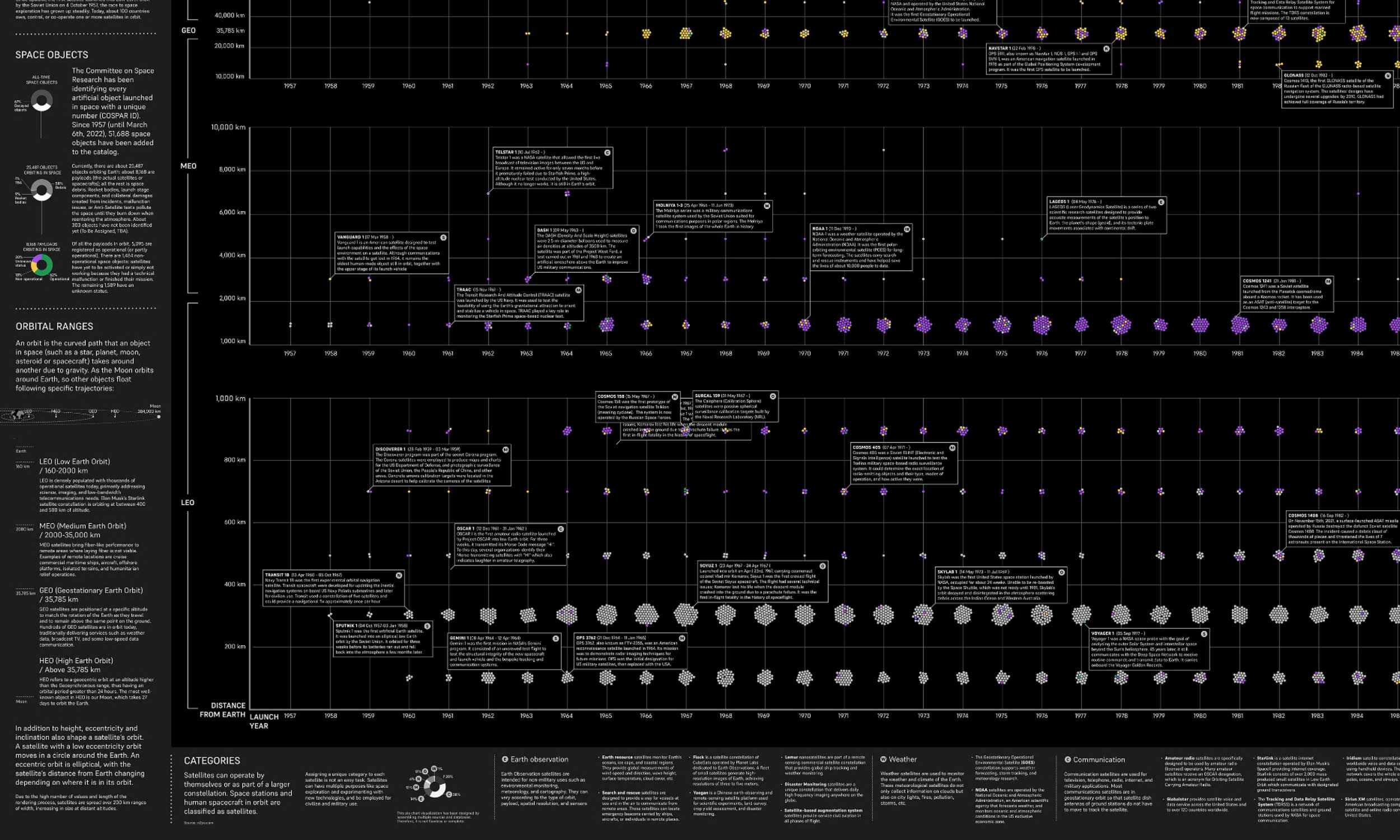
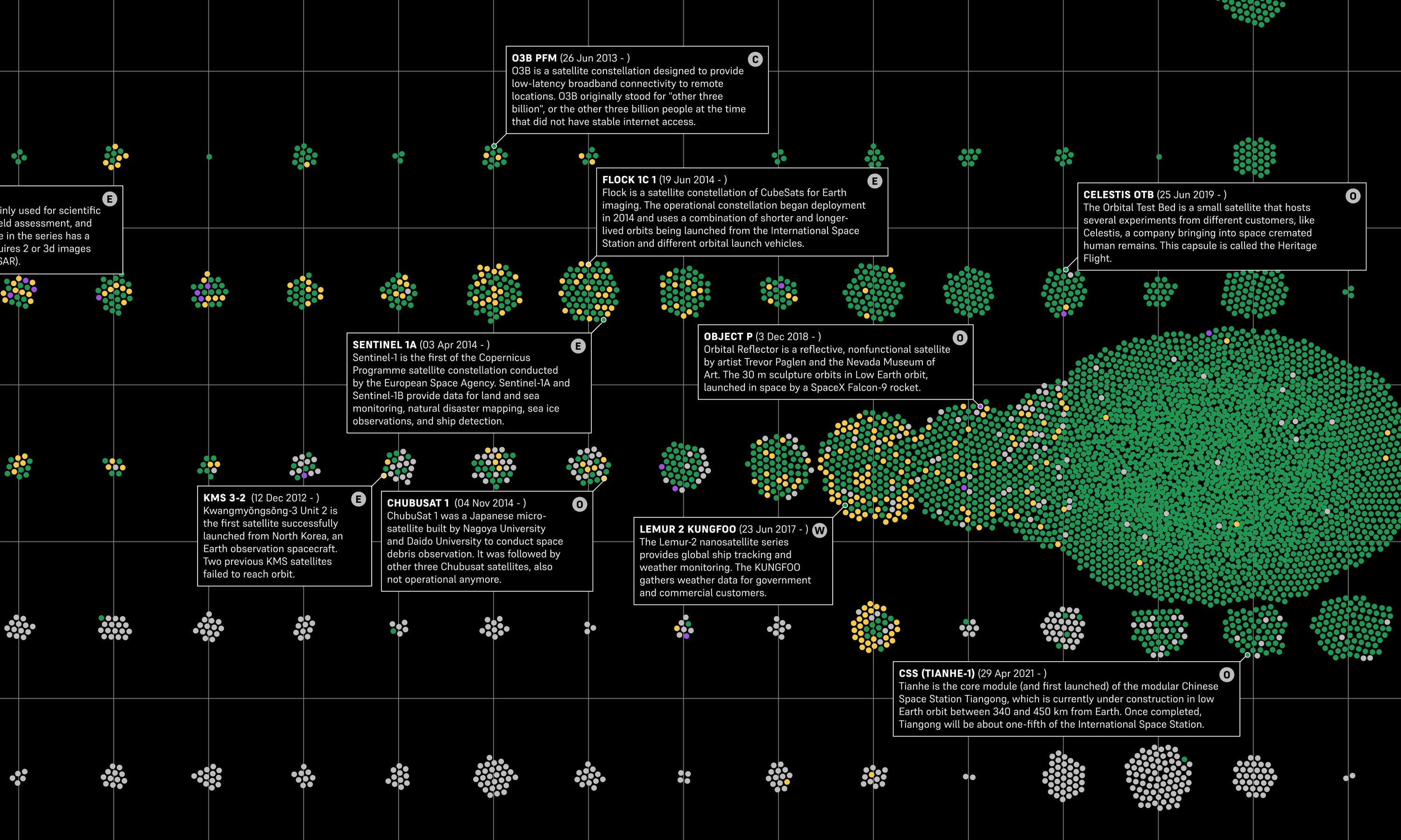
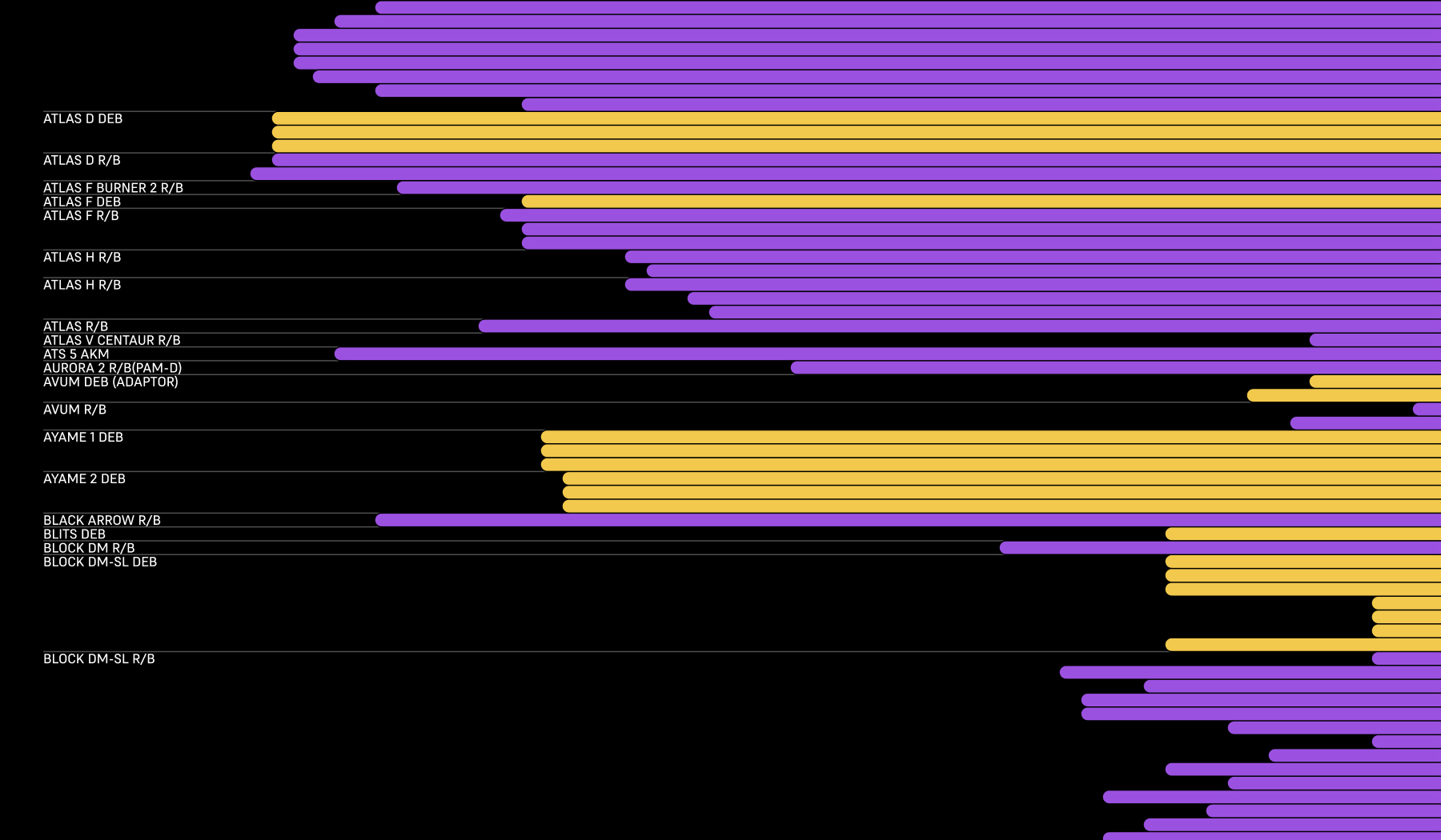
visualization functions as an index to unlock related stories. More than eight thousand satellites
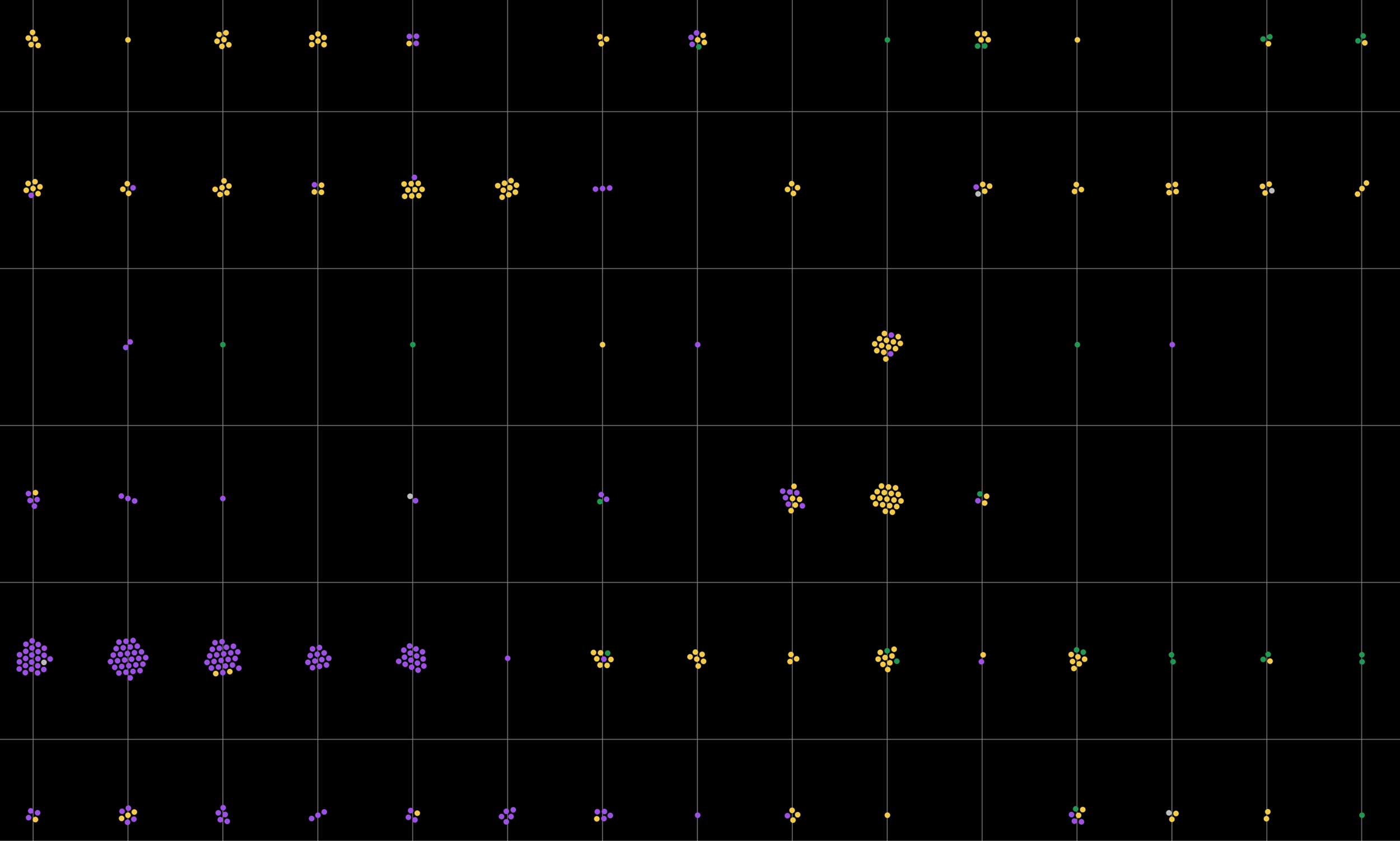
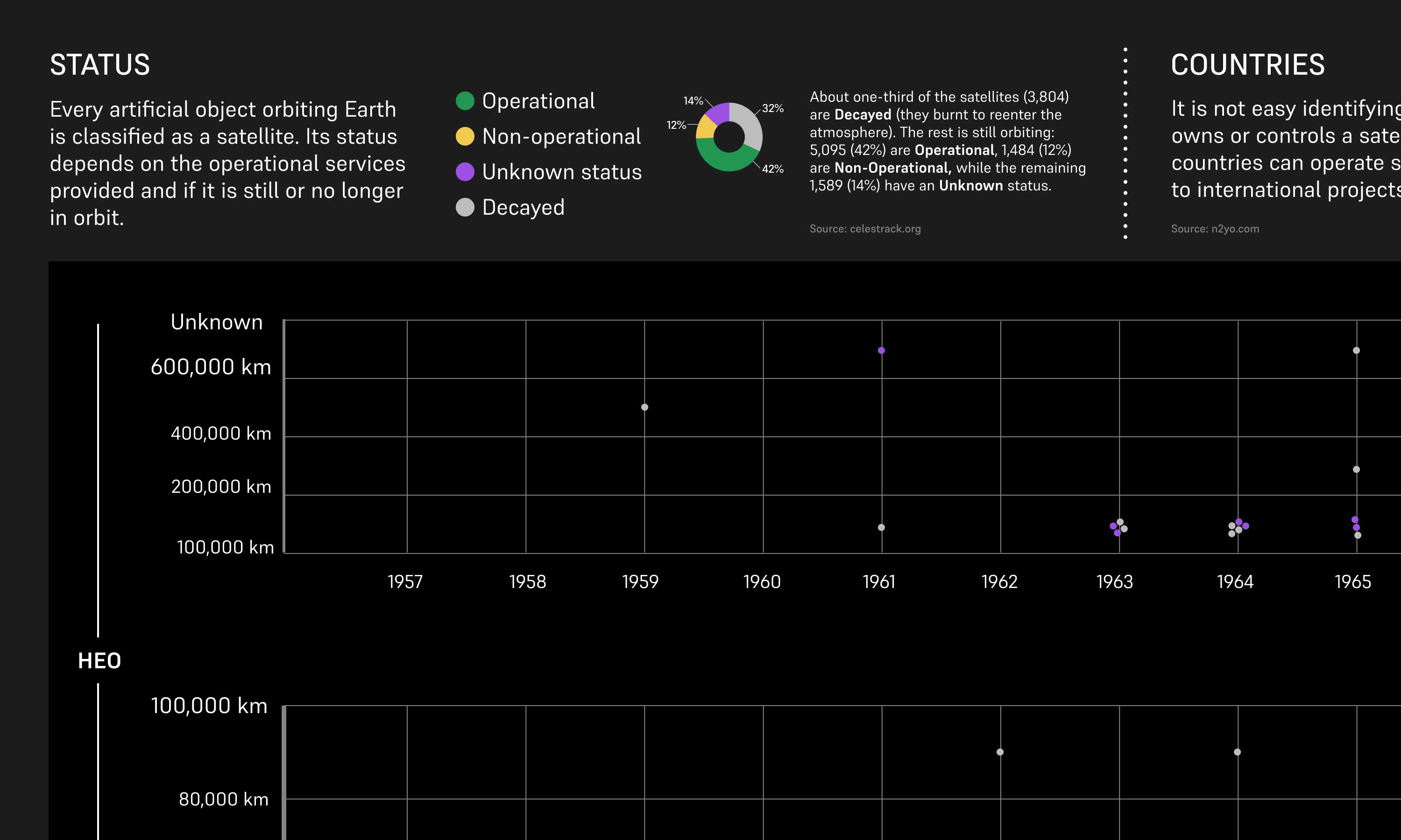
are plotted on the chart: the data show how many satellites are still operational or decayed, who
launched them, and in which years.
www.satellitecharts.xyz ↗
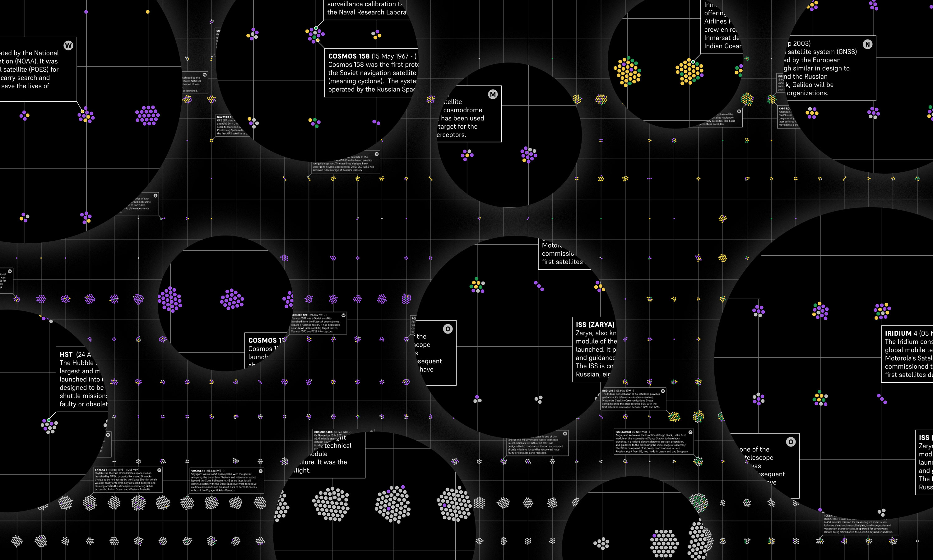
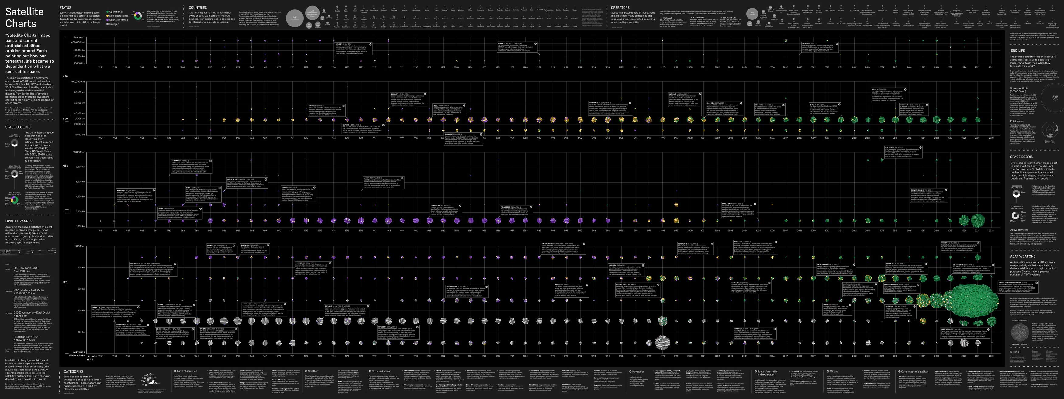
Chart at its full size
Displaying such information on a flat design allows the viewer to zoom in and out in time. In about 70 years of space history, we slowly built an extension of Earth's infrastructure above our head, an extra level of data collection and exchange. Satellites are essential technologies that must be constantly safeguarded, especially from human threats: jobs, services, social gatherings, transport, and communications are strictly dependent on the network of artificial bodies monitoring the planet. It is impossible to imagine our current living standards and global connections without the data transmission between satellites and Earth stations. This is what keeps the world spinning.
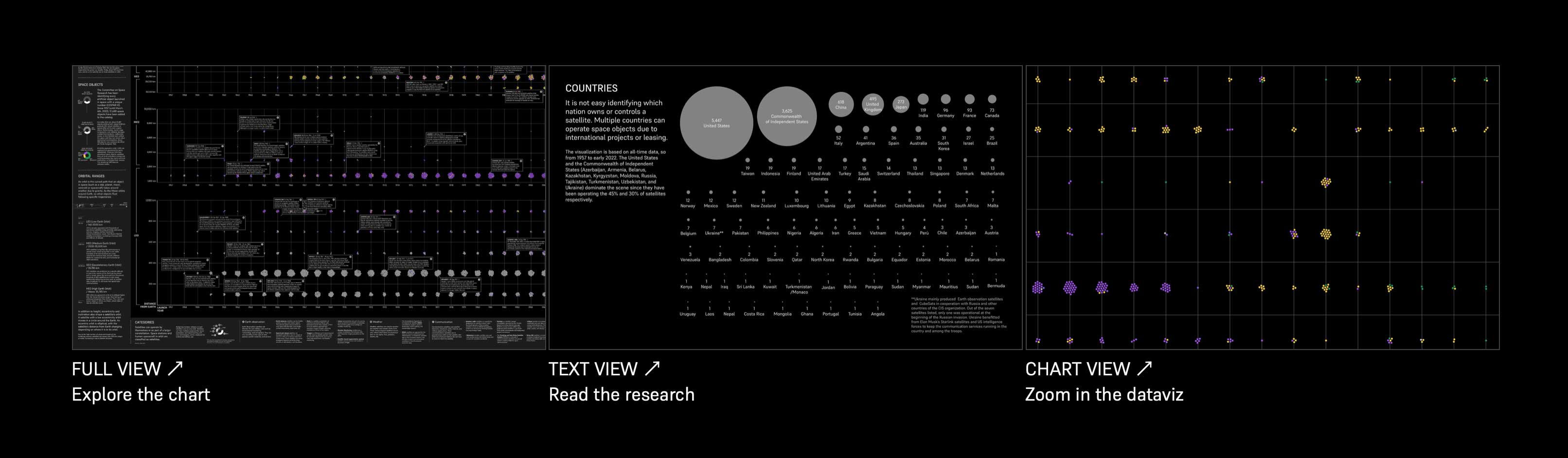
1. FULL VIEW: You can browse freely across the chart, clicking on the info boxes to know more about each satellite

2. TEXT VIEW: You can read about the research in the shape of a simple long-form
3. CHART VIEW: You can browse the satellites by their launch years, with the Earth's orbits axis fixed on the left
The high number of data (combined by merging multiple databases) made it
difficult to work with live data as well as coding an interactive visualization. Due to the limited
coding skills of the author and the tight deadline, working with a static 2D visualization has been
the most optimal solution.
Beeswarm chart powered by
RAWGraphs.
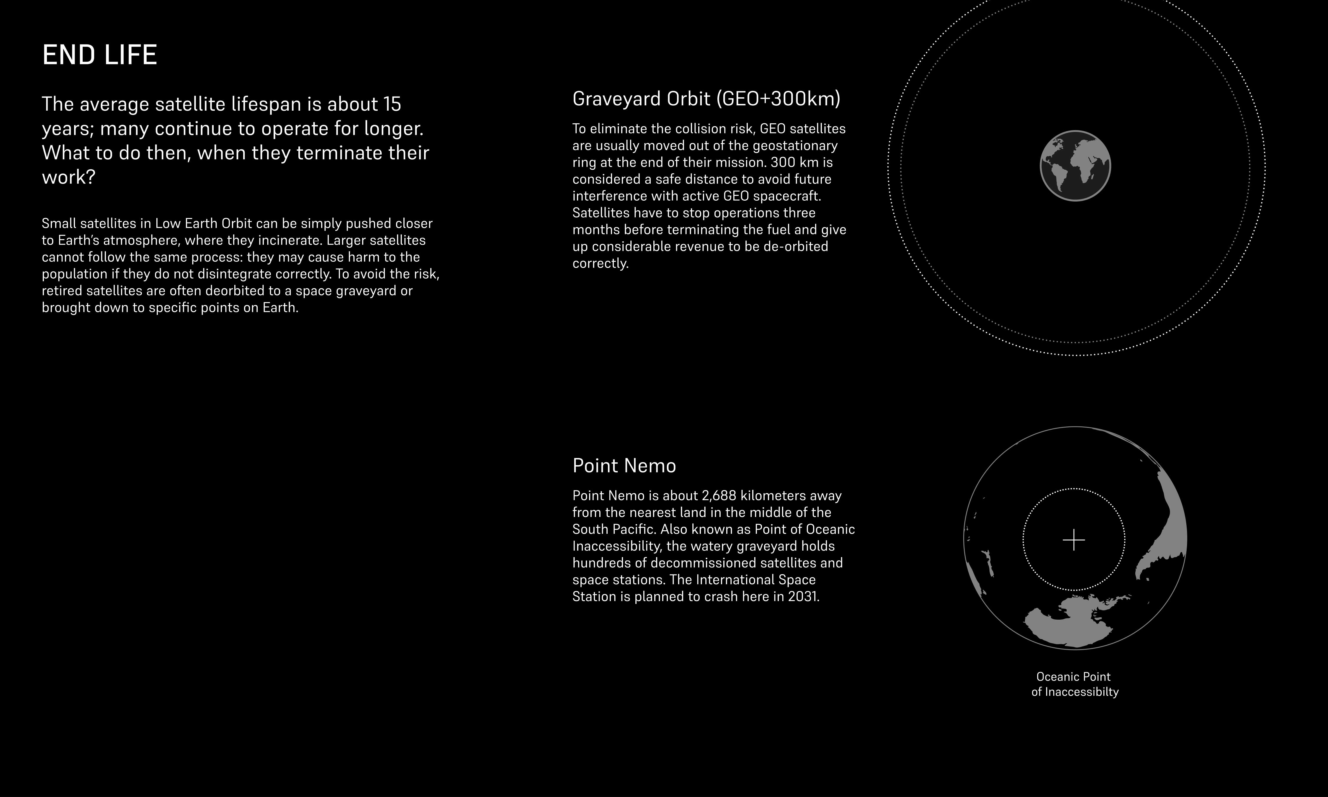
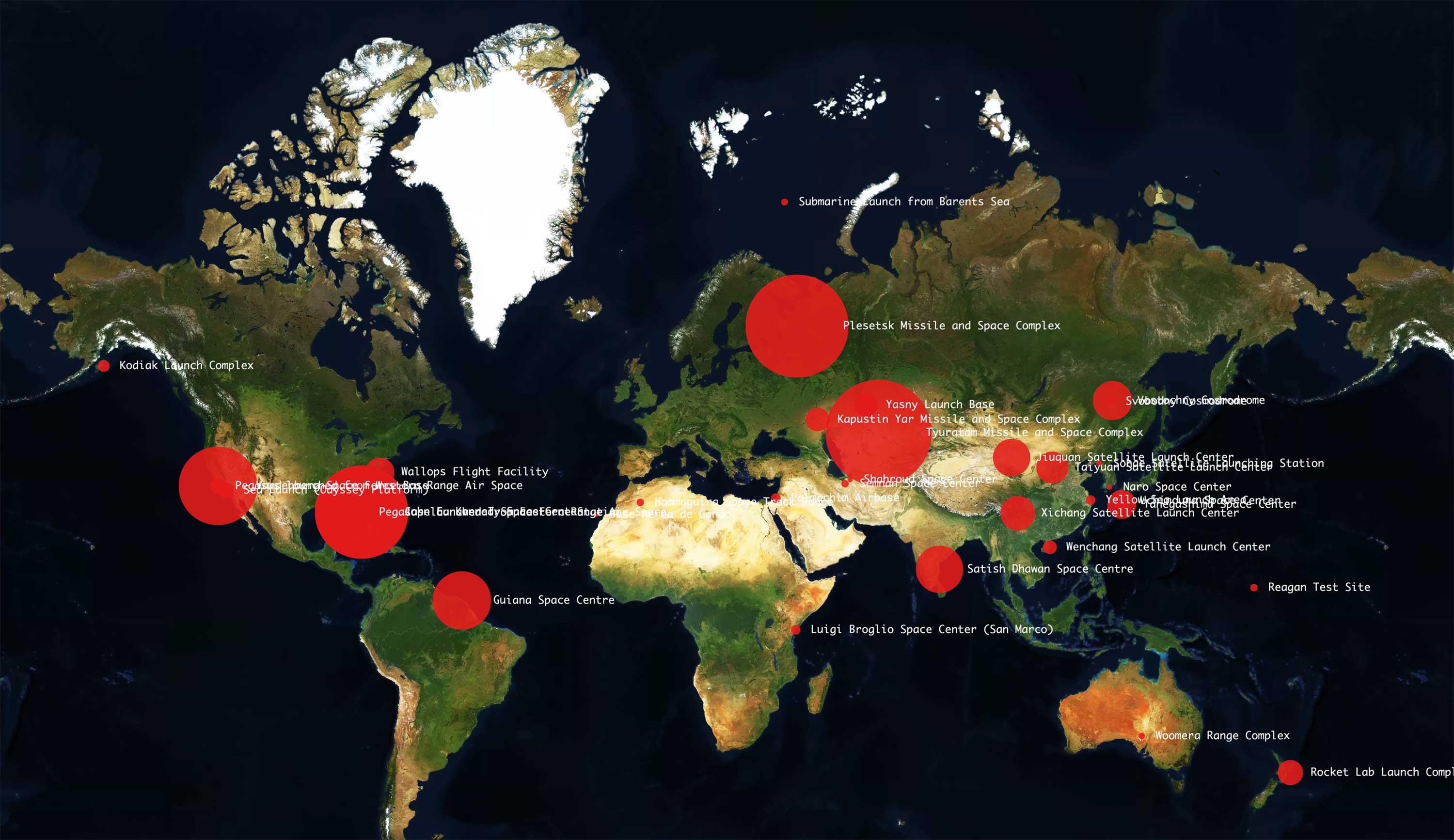
The project was further developed a few months after the online exhibition. More charts and topics (focusing on the geography of launch sites and the past and current space junk) were added as updates.
Online exhibition
Randr Satellite Project
Year
2022