E3CI Data Station
The European Extreme Events Climate Index (E3CI) provides insights into significant weather-related
hazards experienced
across European countries. It offers a comprehensive overview by combining seven components: Extreme
Max and Min Temperature, Drought, Extreme Precipitation, Hail, Fire, and Extreme Wind, with data
from January 1981 until today.
datastation.climateindex.eu ↗
In recent years, the definition of Extreme Weather Events has become a recurring theme in our daily
news. The landscape and occurrence of seasons are being reshaped by severe tornadoes, floods,
droughts, heat waves, fires, etc. The concept of 'extreme' is fast becoming the 'new normal,'
marking the profound impact of climate change during the early 21st century.
The European Climate Index emerges as a new reference tool, providing insights into the significant
weather-related hazards experienced across European countries. Each of the seven components (Max and
Min Temperature, Drought, Precipitation, Hail, Fire, and Wind) uses an indicator as a proxy for
various hazards. The reference values are computed based on the 1981-2010 timeframe, while the E3CI
presents a monthly standardised anomaly relative to these benchmarks. In simple words, climate
events with values over 1 are considered extreme.
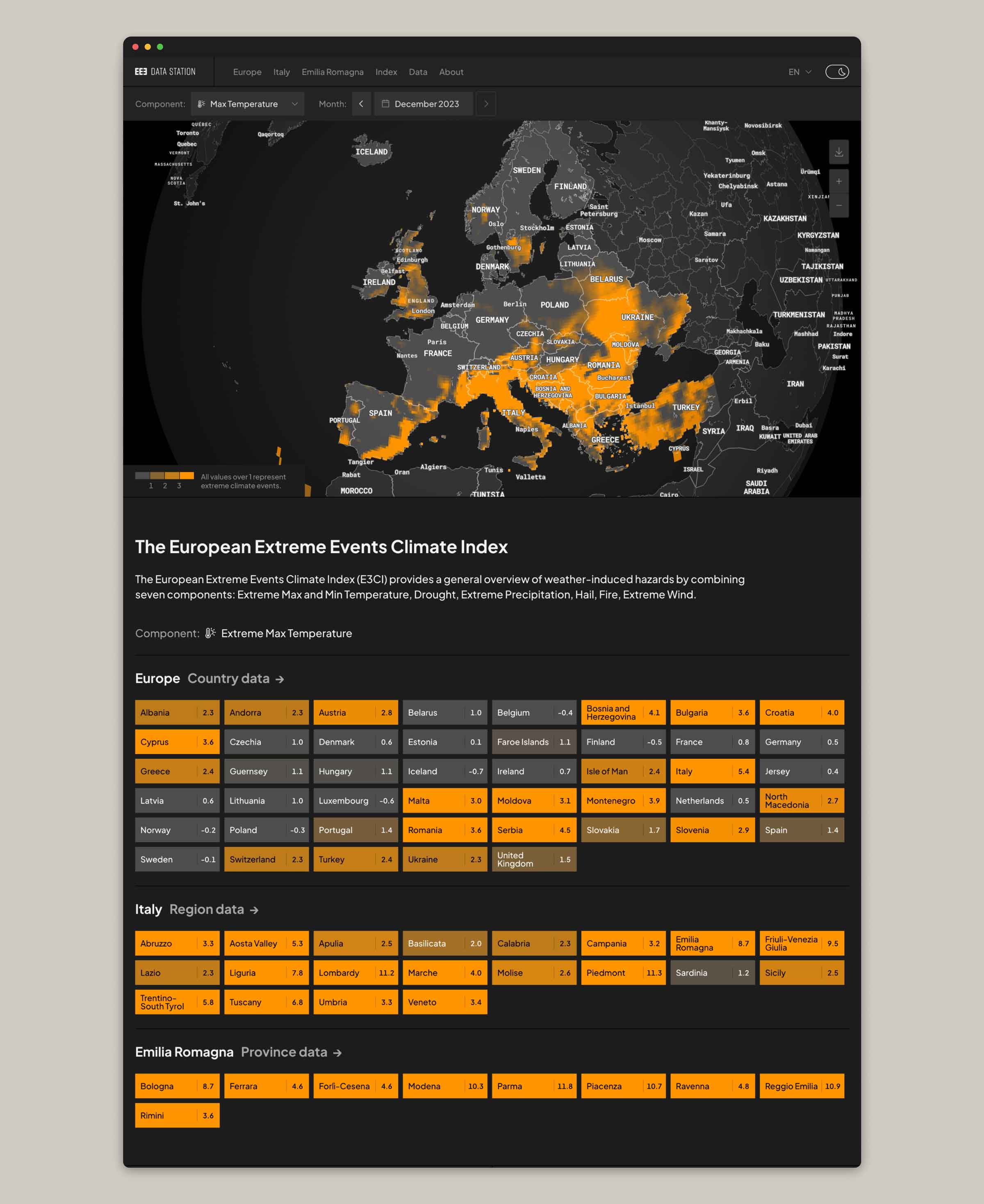
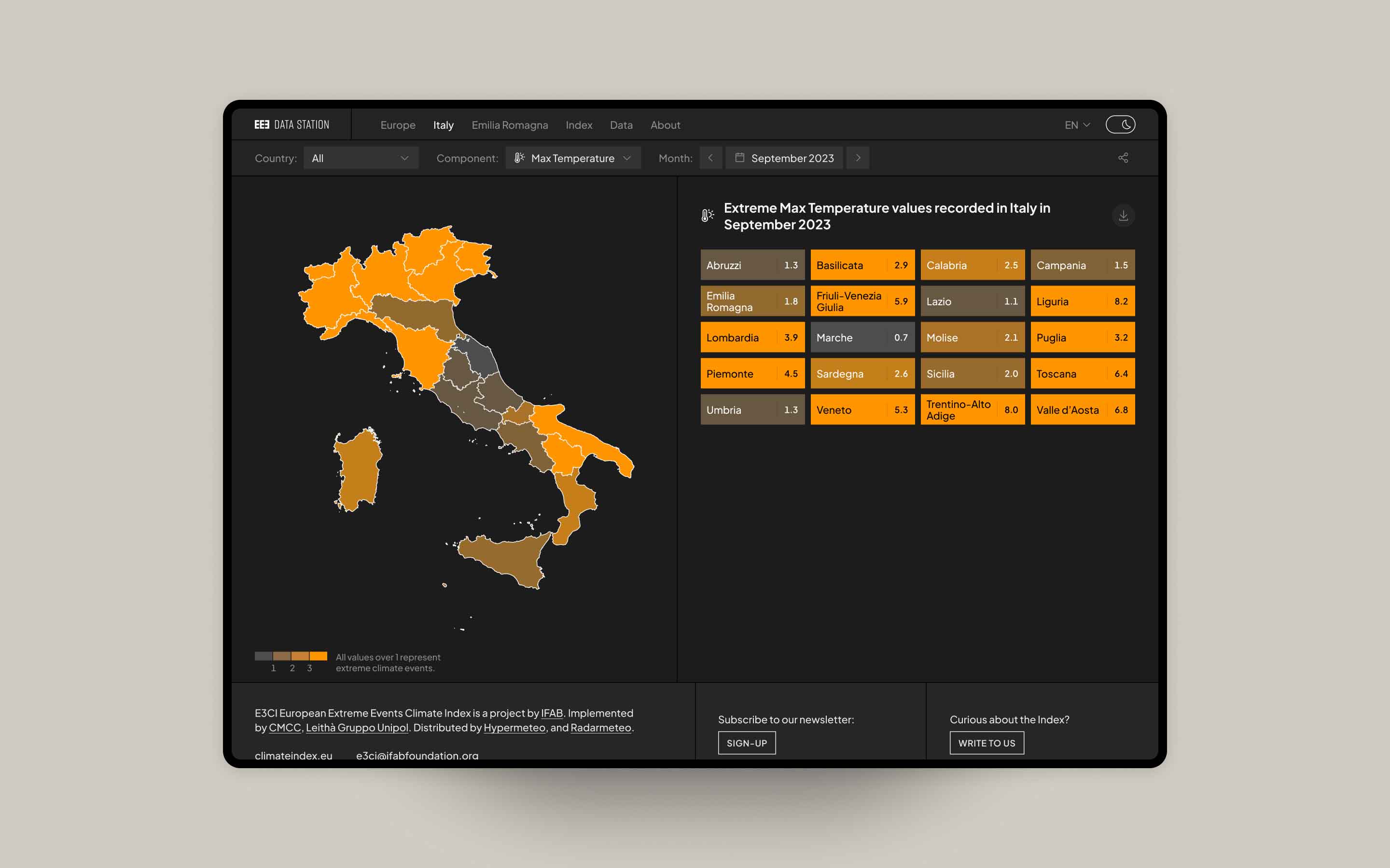
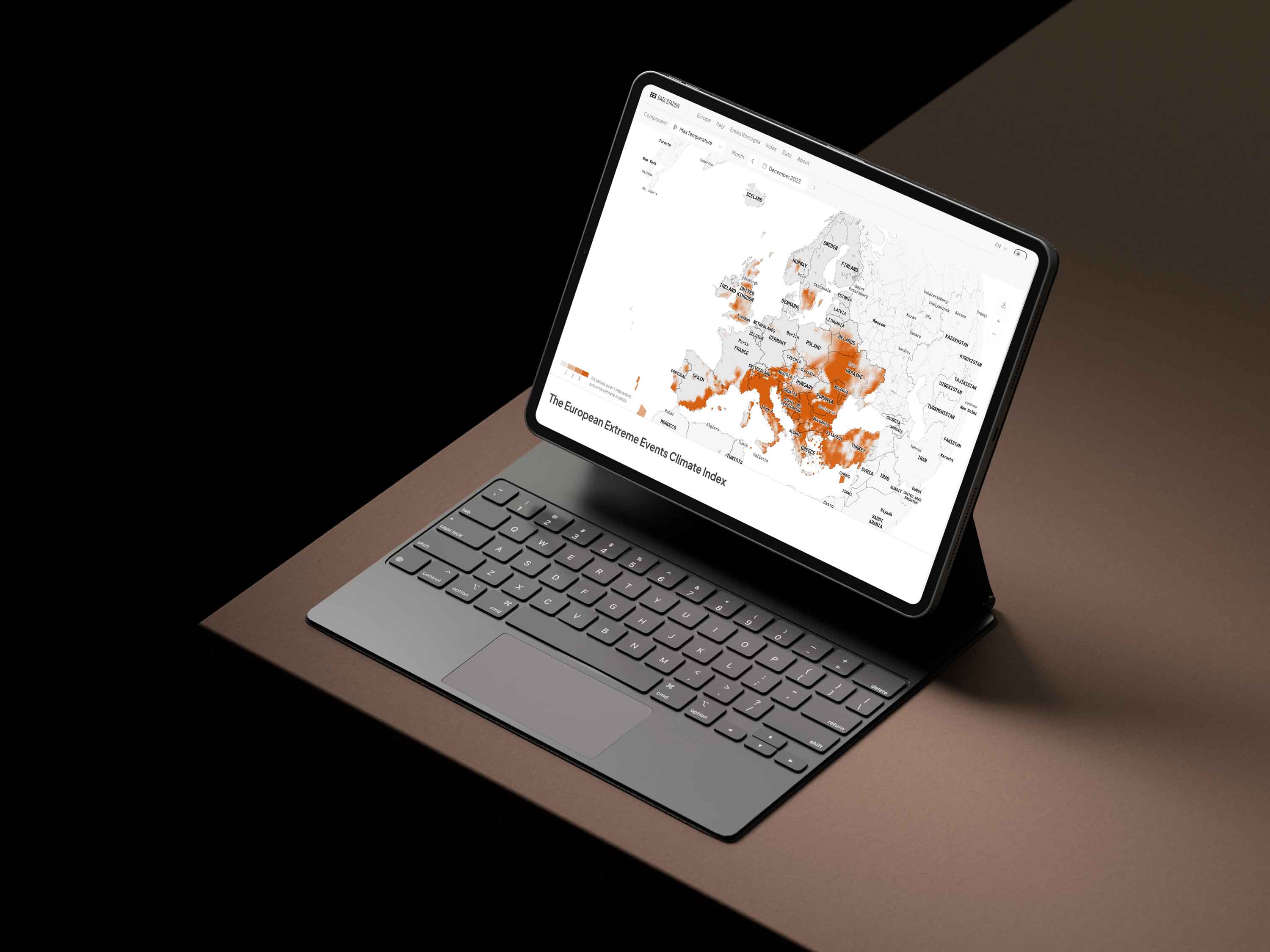
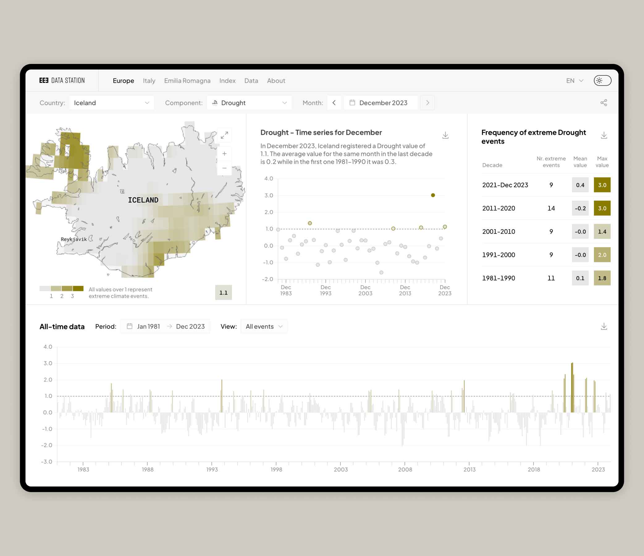
Homepage showing data related to the Extreme Max Temperature component.

Structure
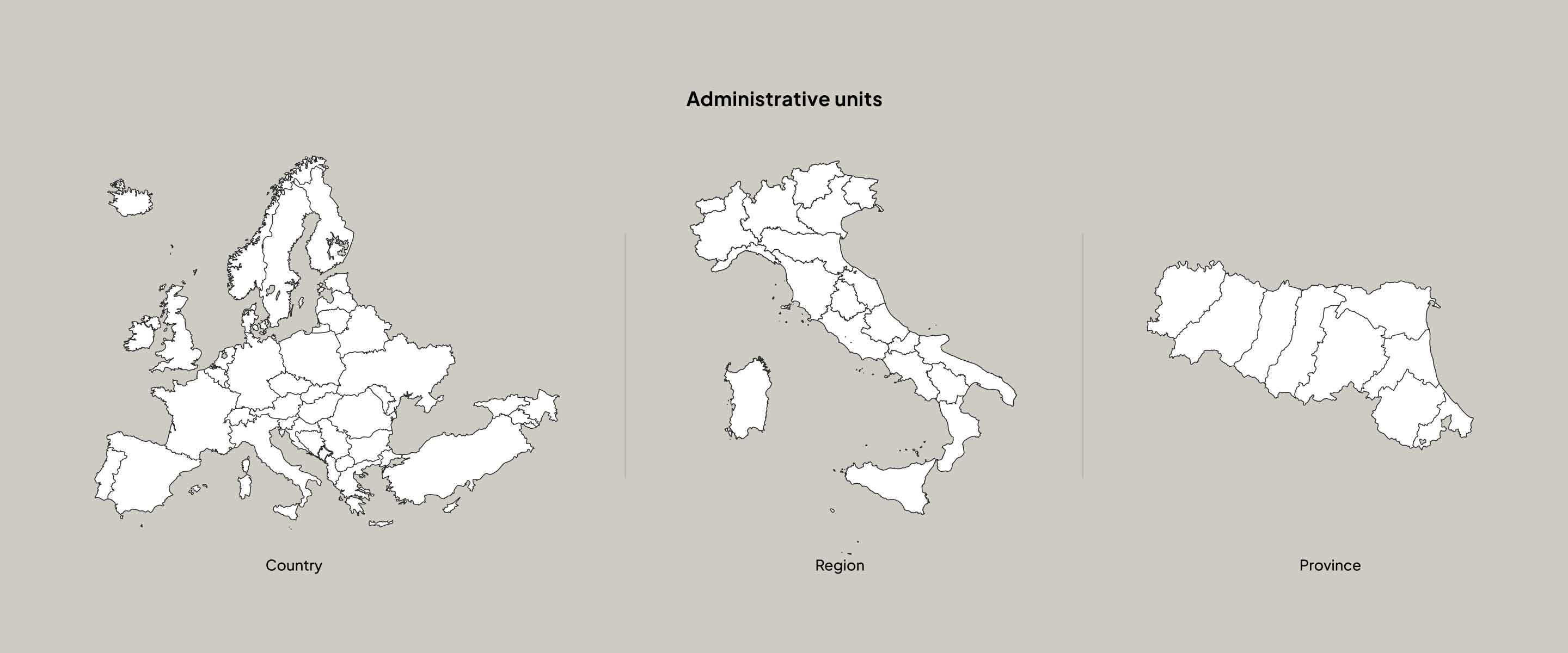
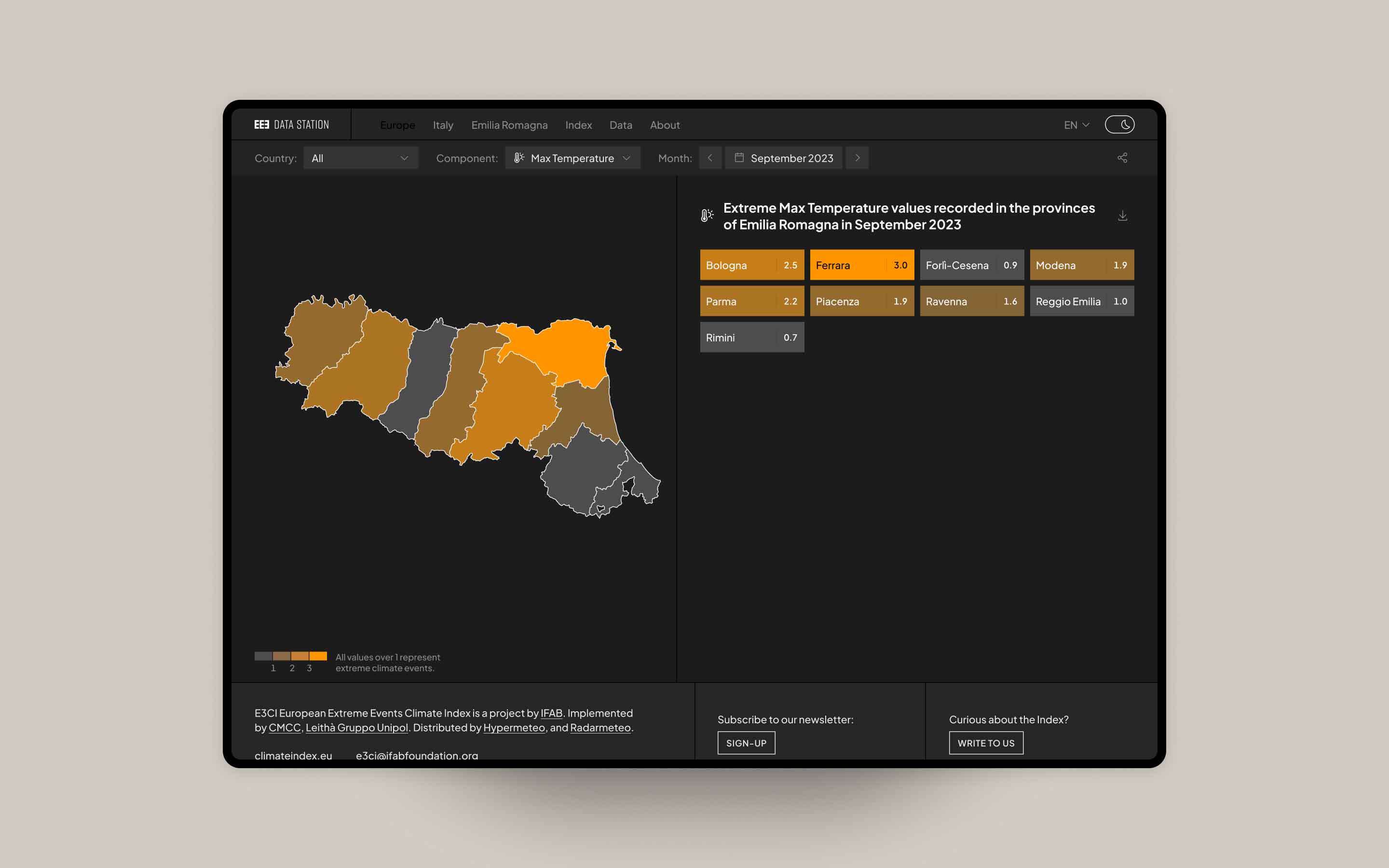
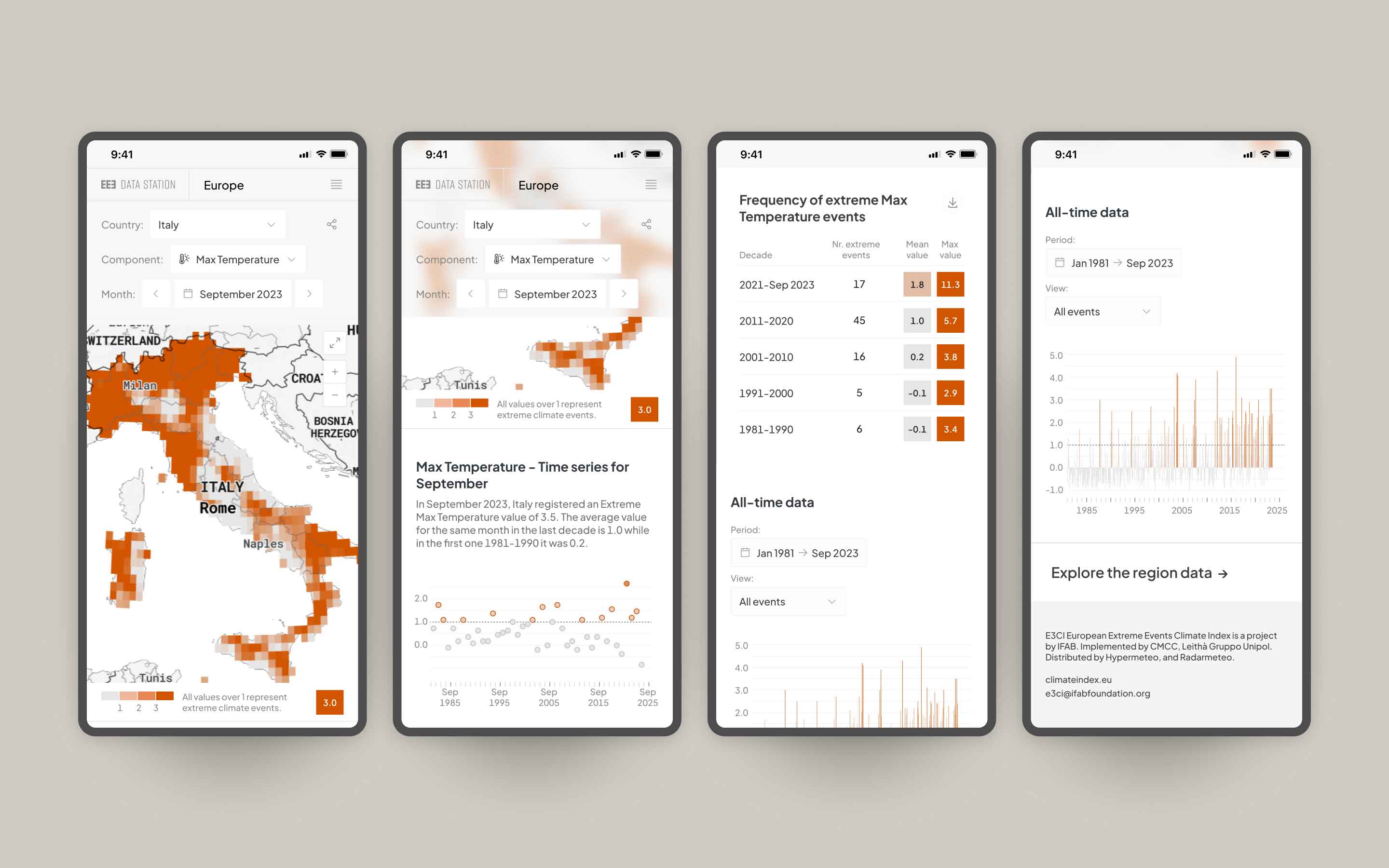
The platform presents up-to-date weather information organised into three administrative units:
country (including all European nations), region (for the twenty Italian regions), and province
(only available for the Emilia Romagna region). The geo-referenced data points, spanning seven key
indicators, are gathered on a monthly basis. The interface allows users to seamlessly integrate
time, geographical location, and index components on every page, providing comprehensive insights
for Europe, Italy, and Emilia Romagna.
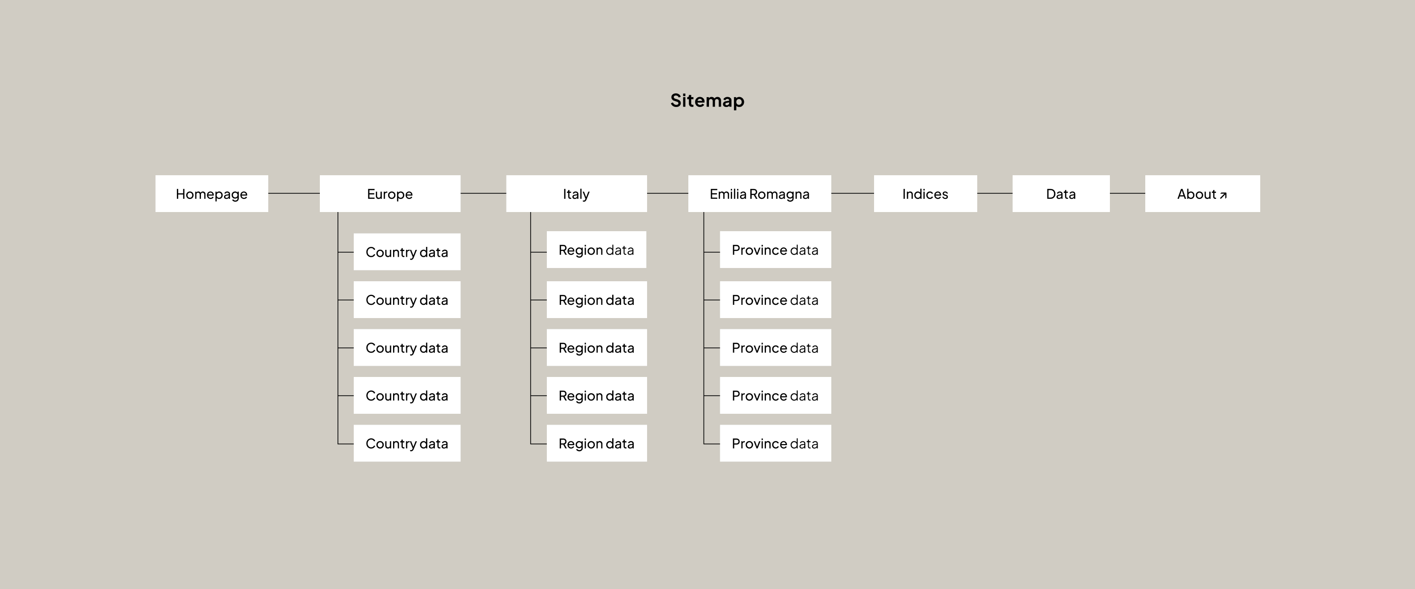
Platform structure.
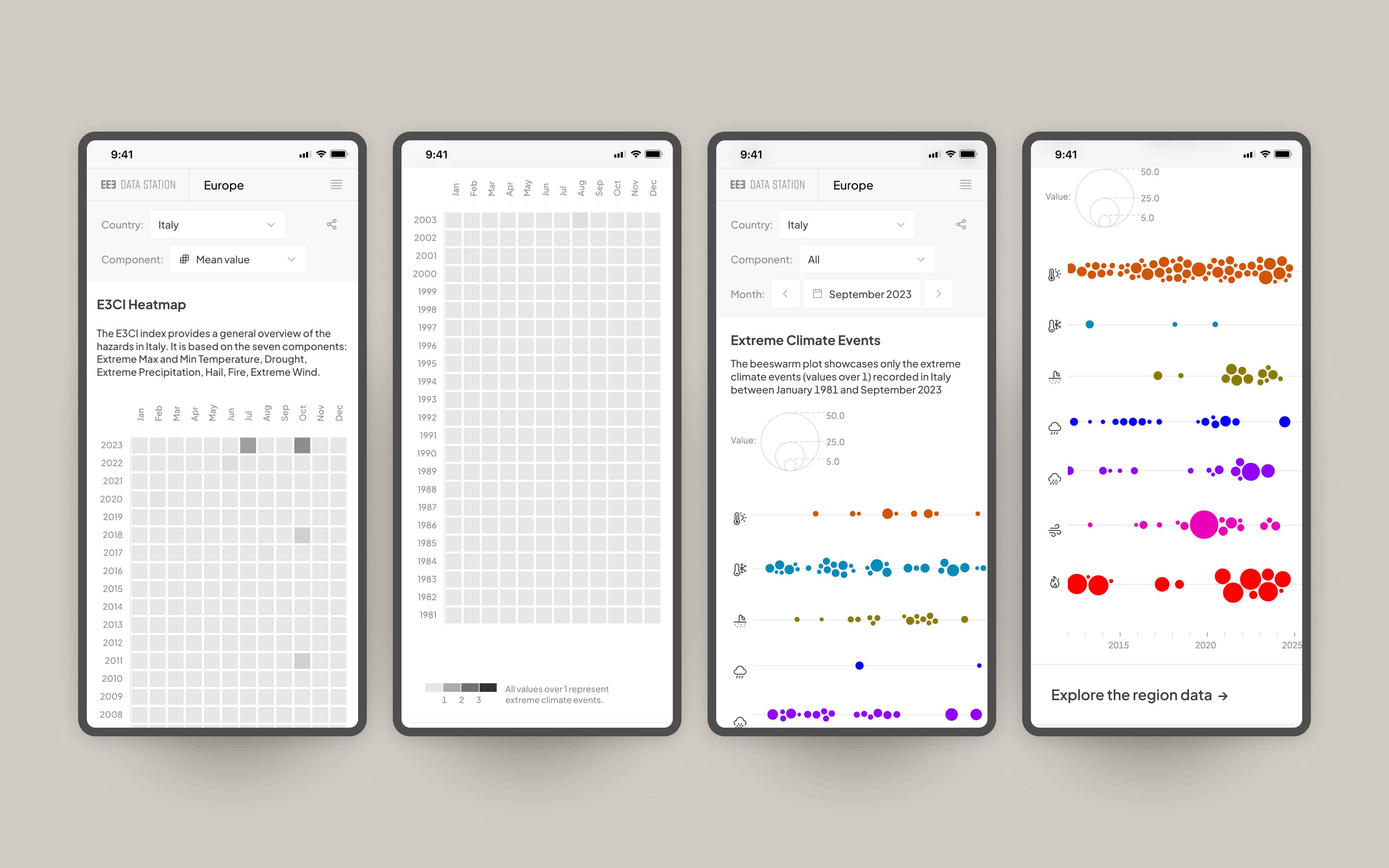
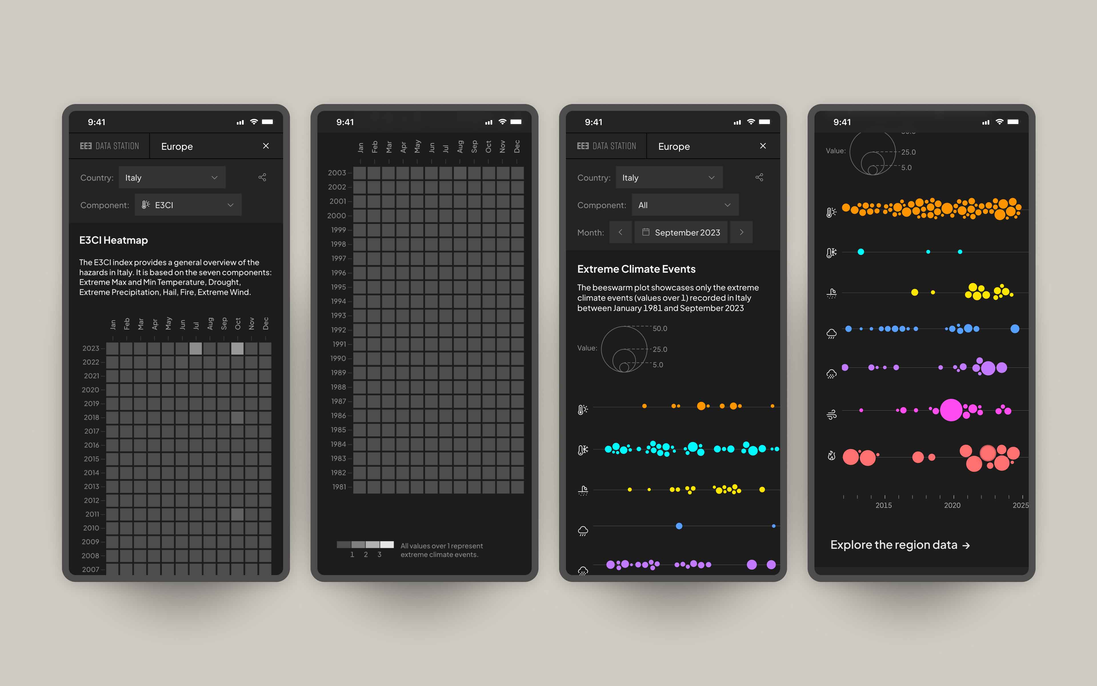
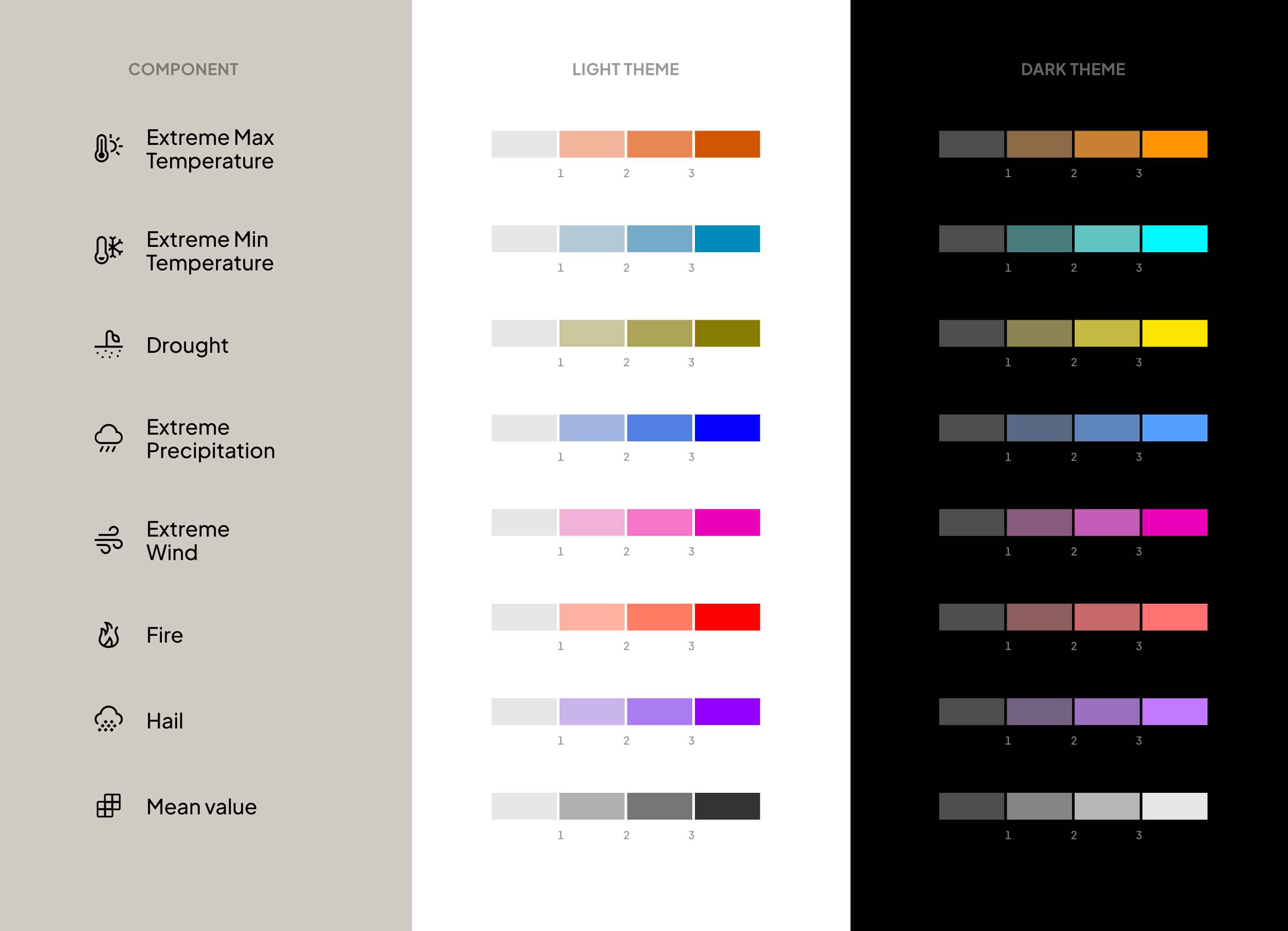
Extreme meteorological events are monitored through seven indicators, plus the mean value, which offers a general overview of the hazards.
Region and province data of the other European countries are available upon request.
For each administrative level, a landing page summarise the latest data. The box containing the name of the geographical area and the index value serves both as a snapshot of information and as a clickable button to access the related dashboard page.
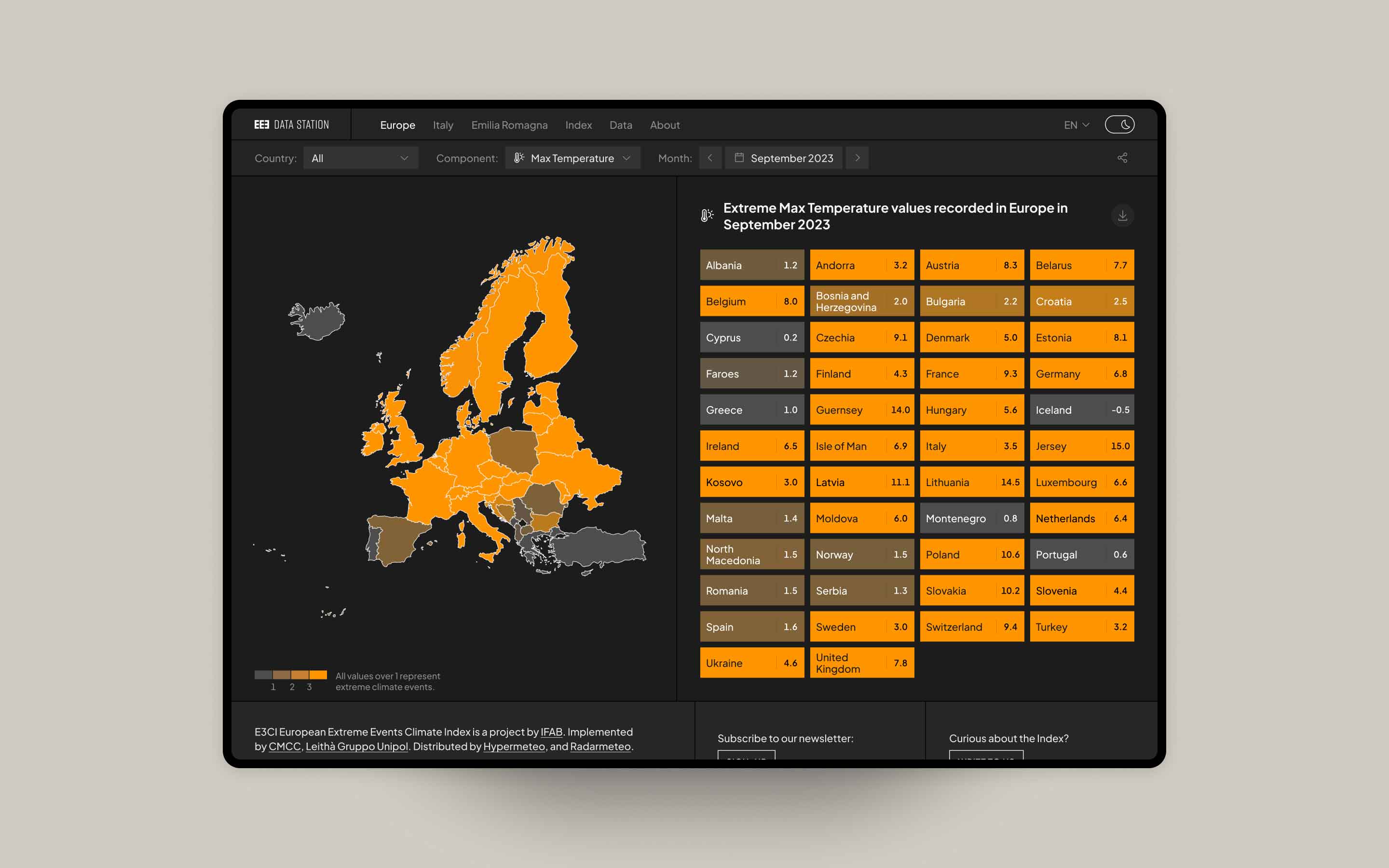
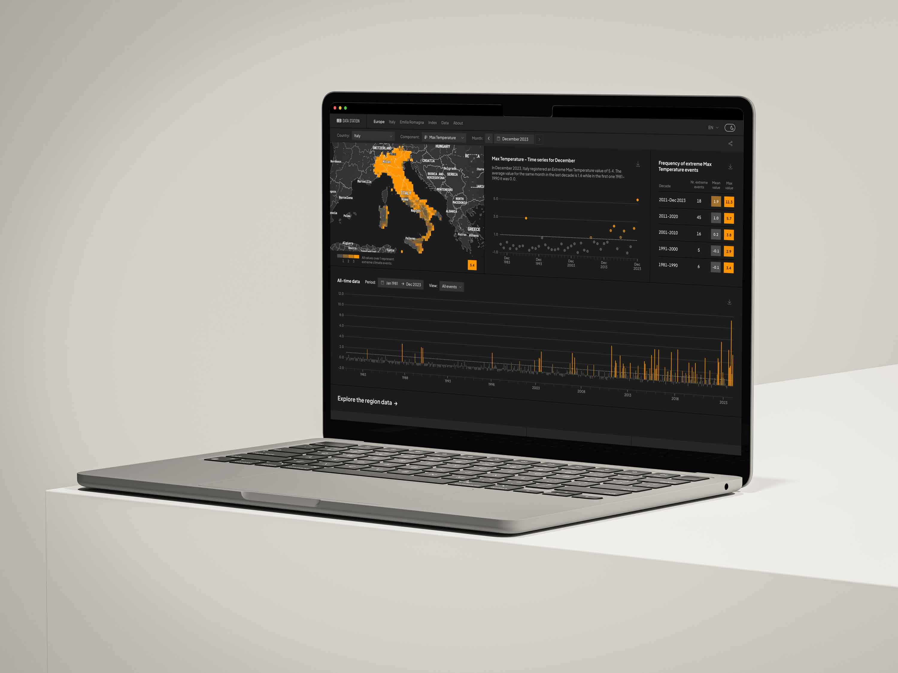
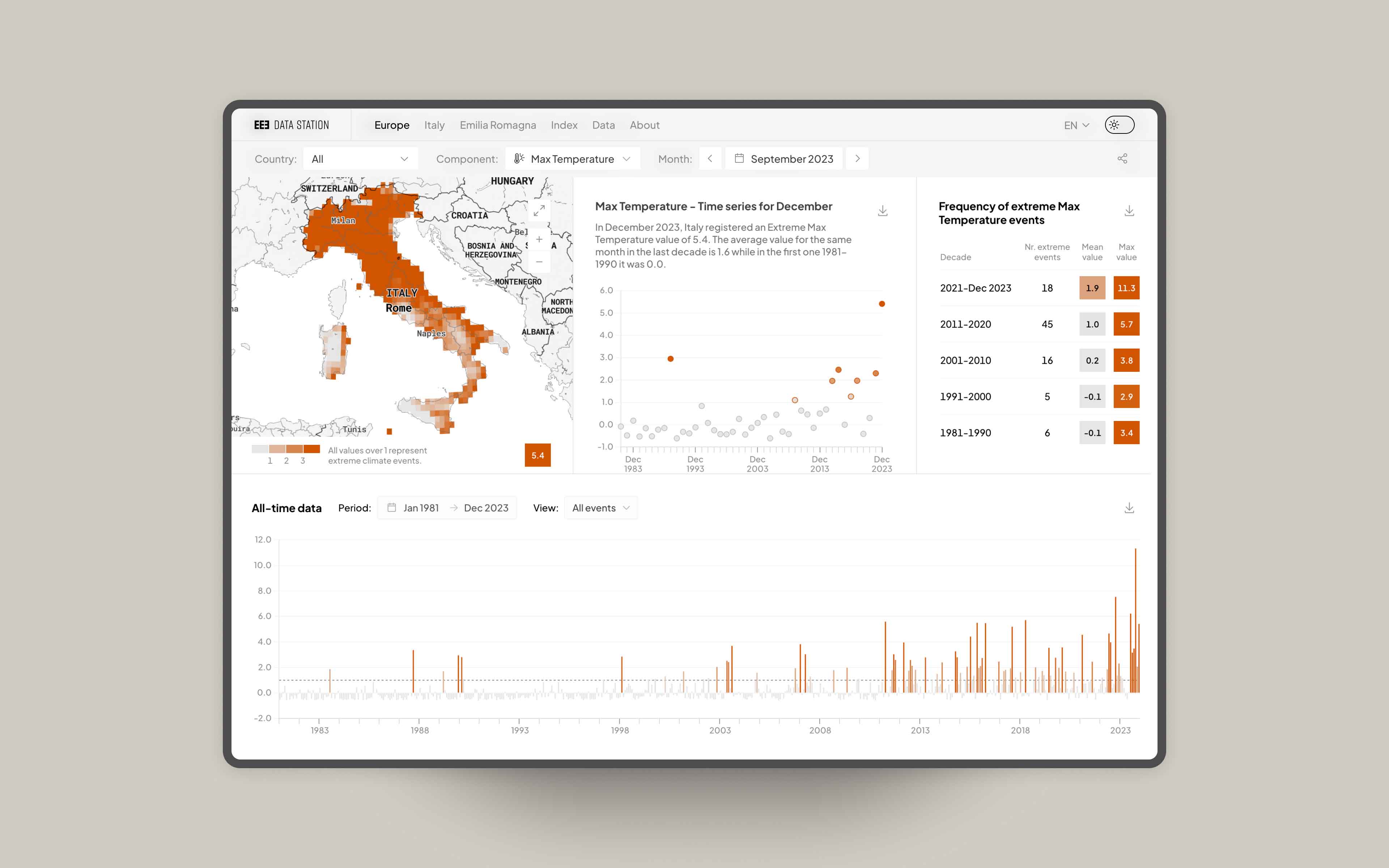
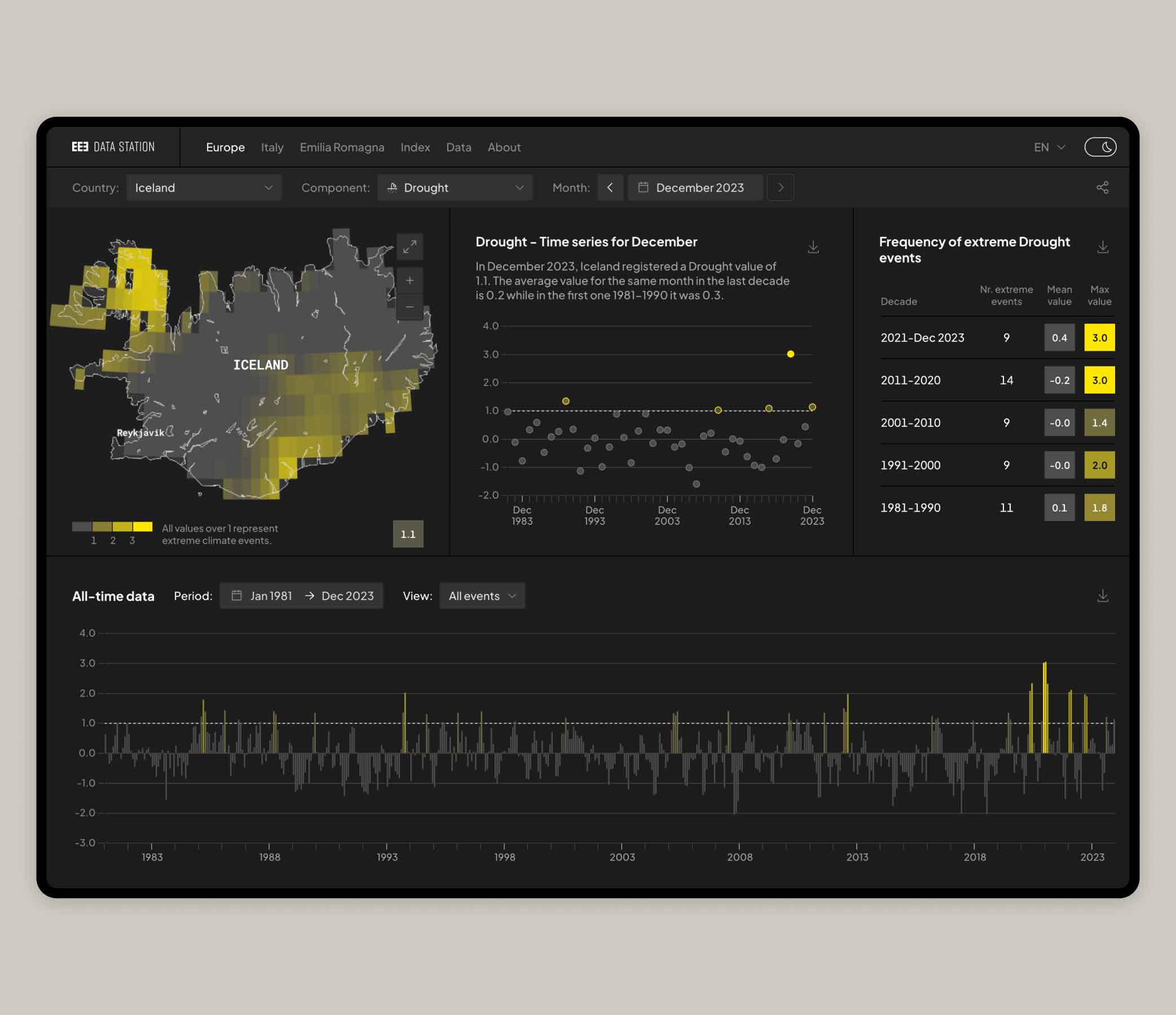
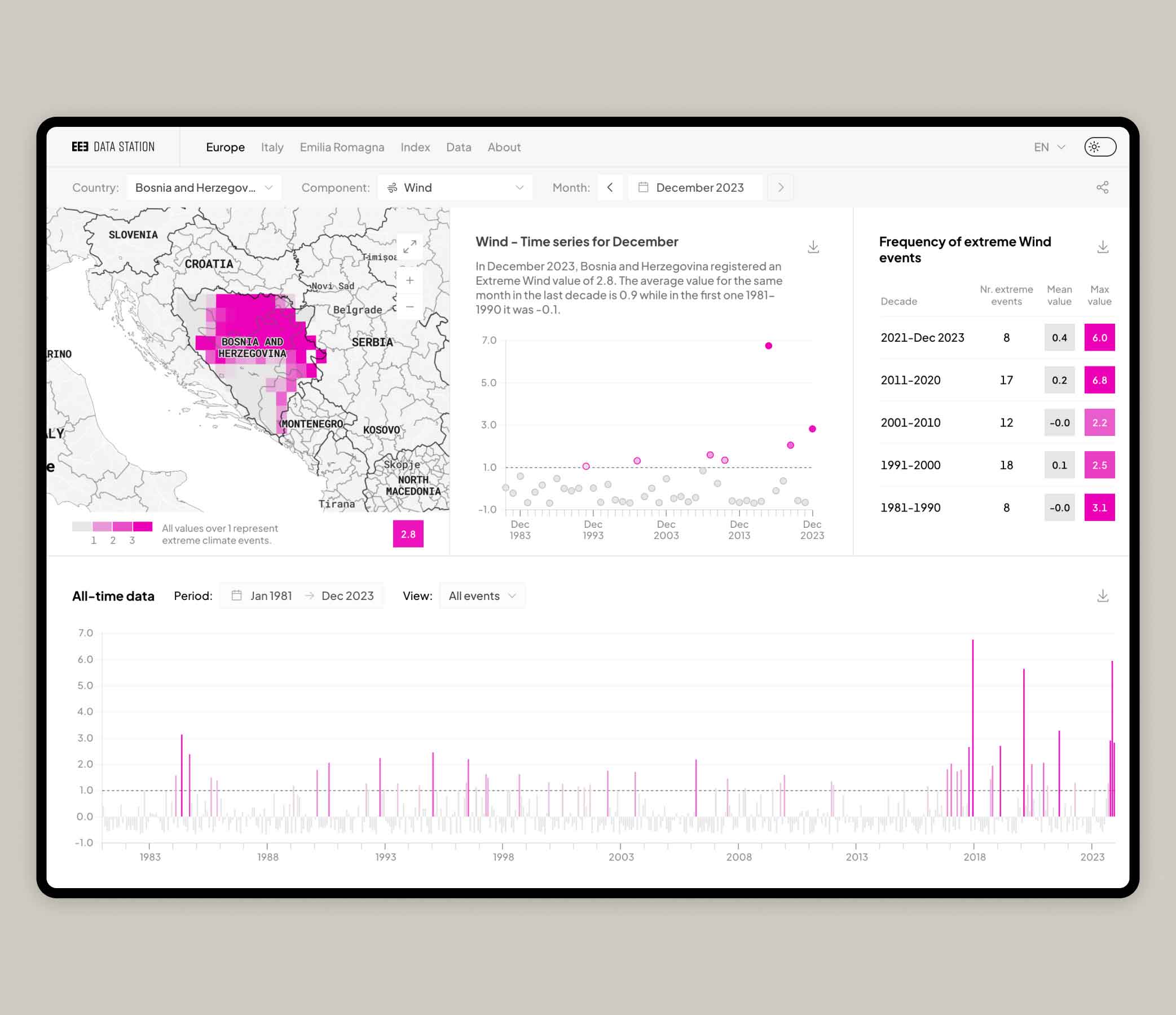
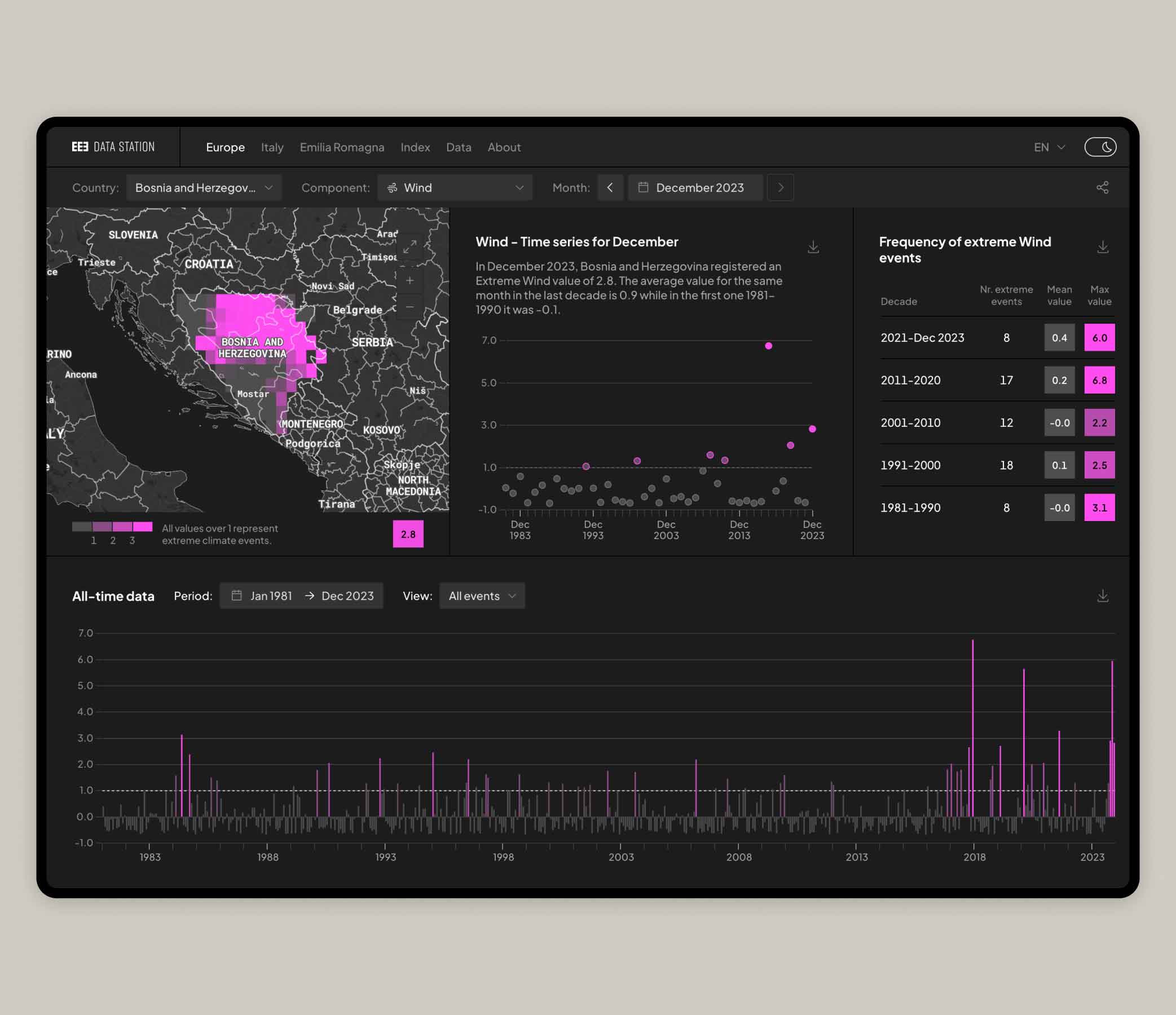
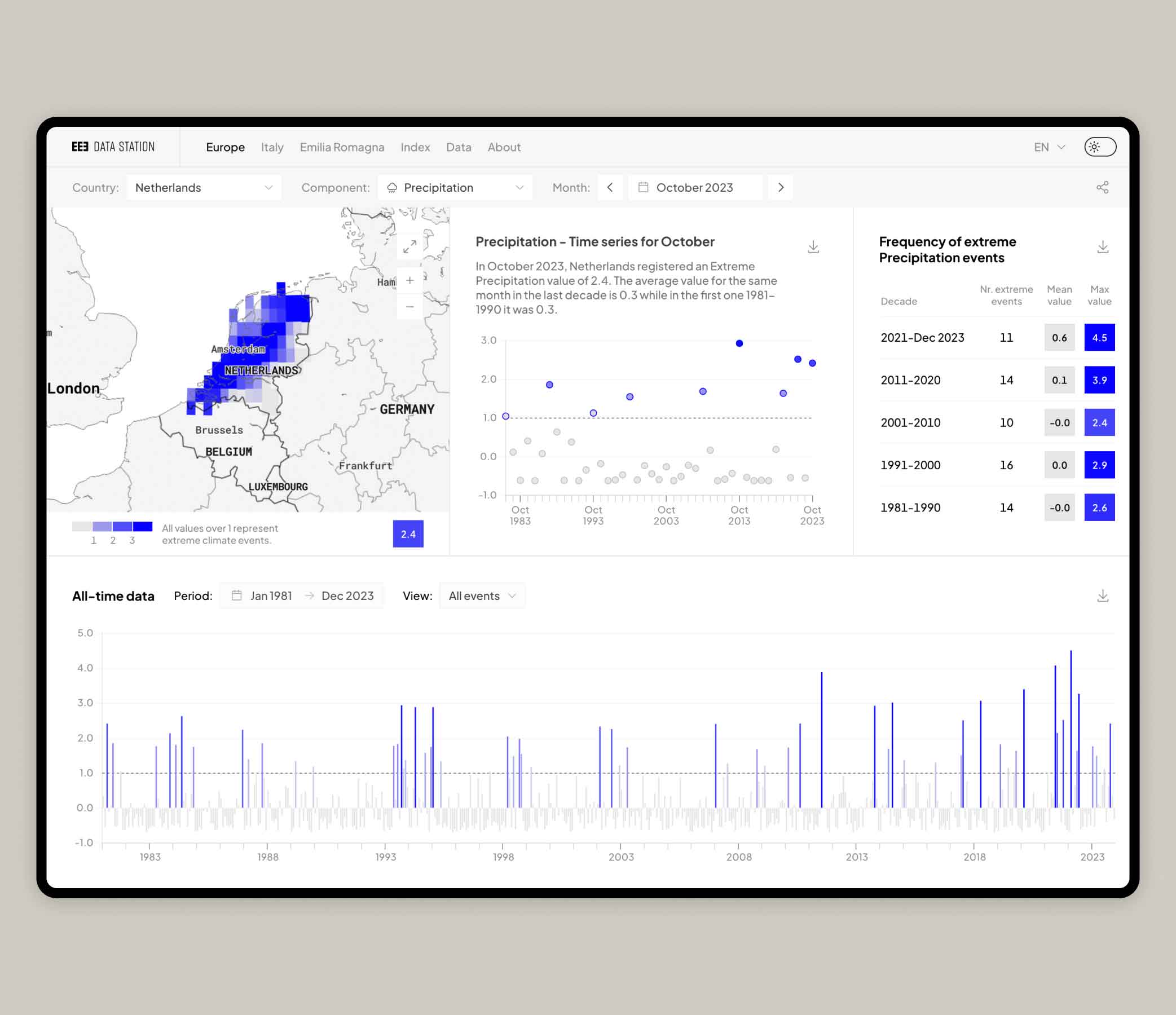
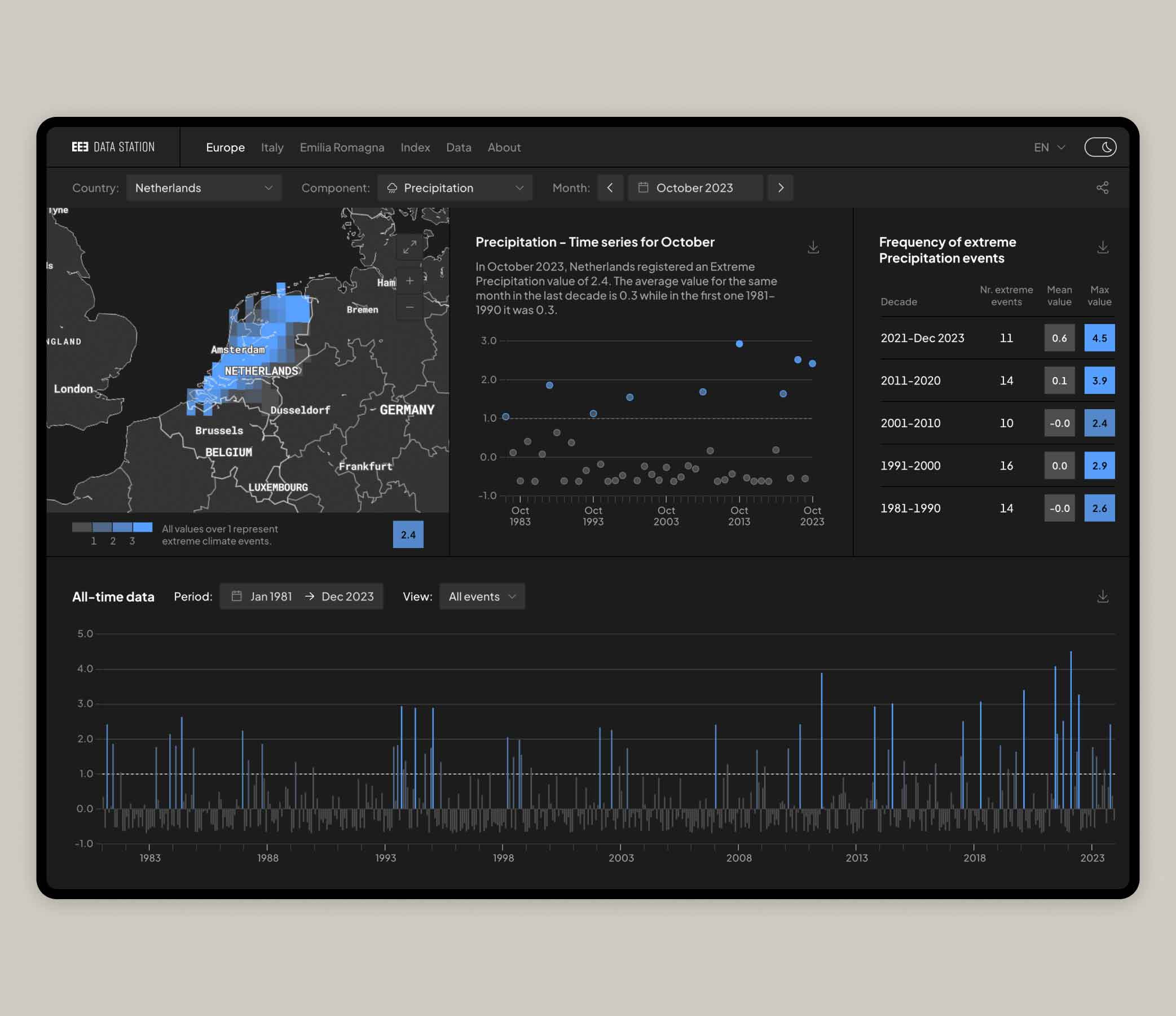
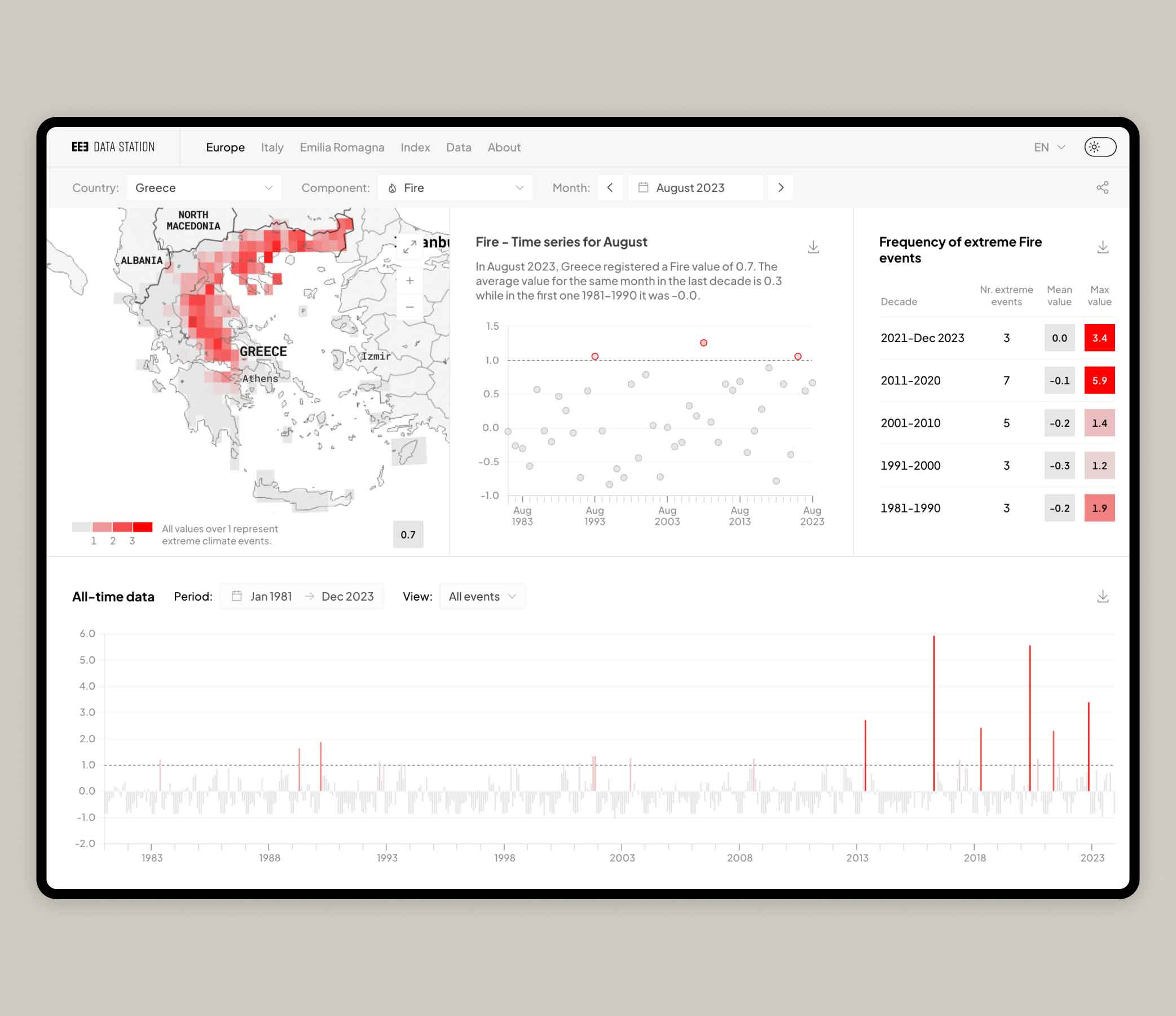
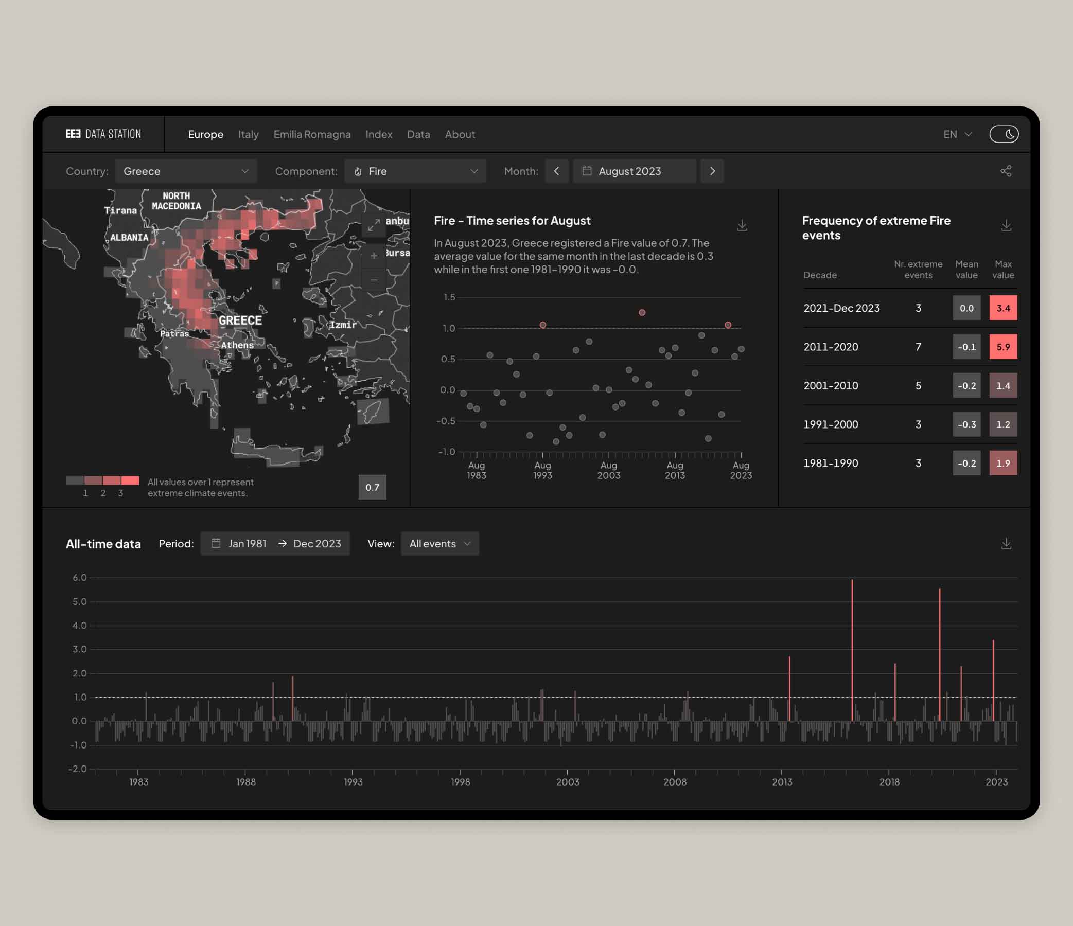
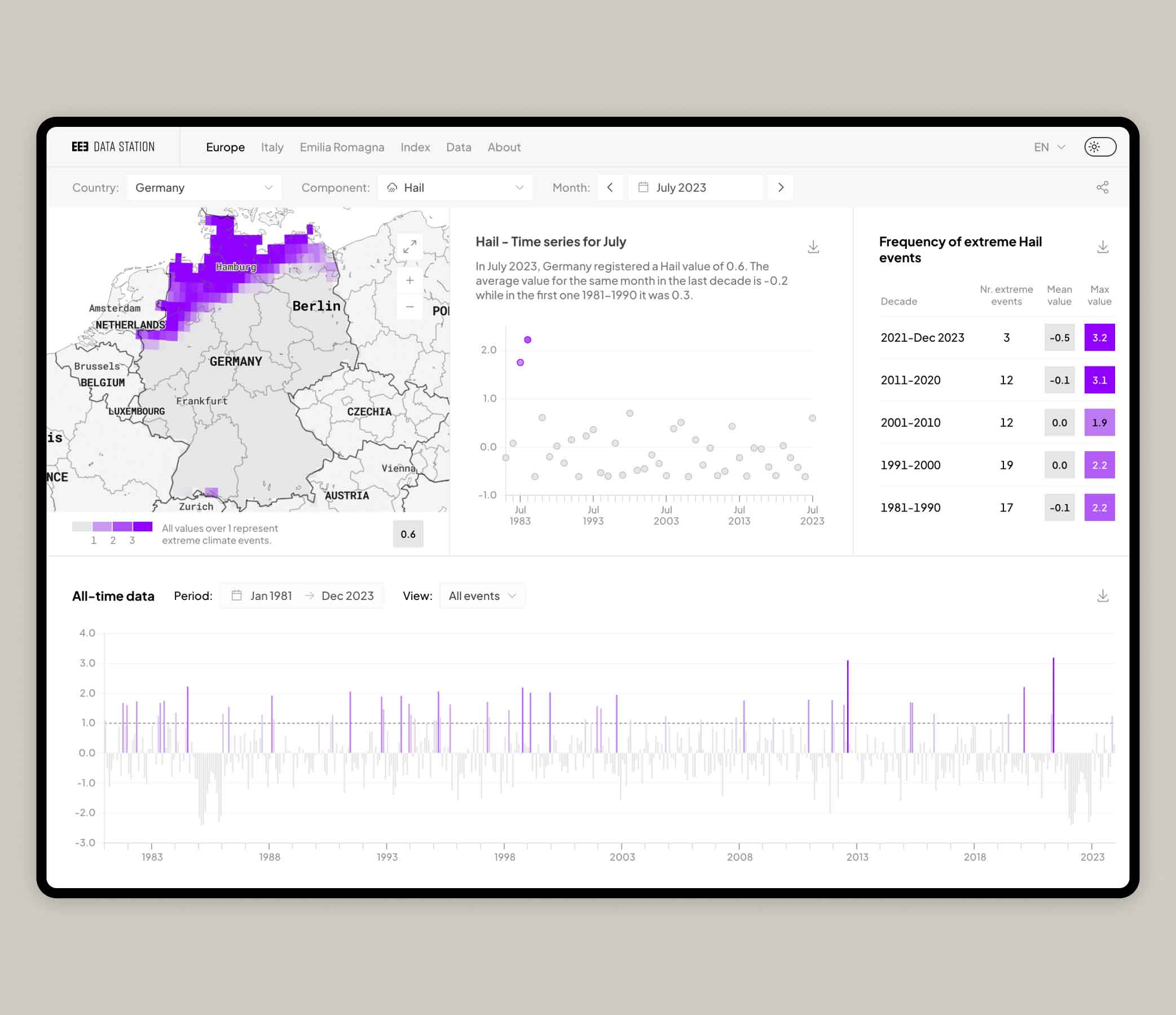
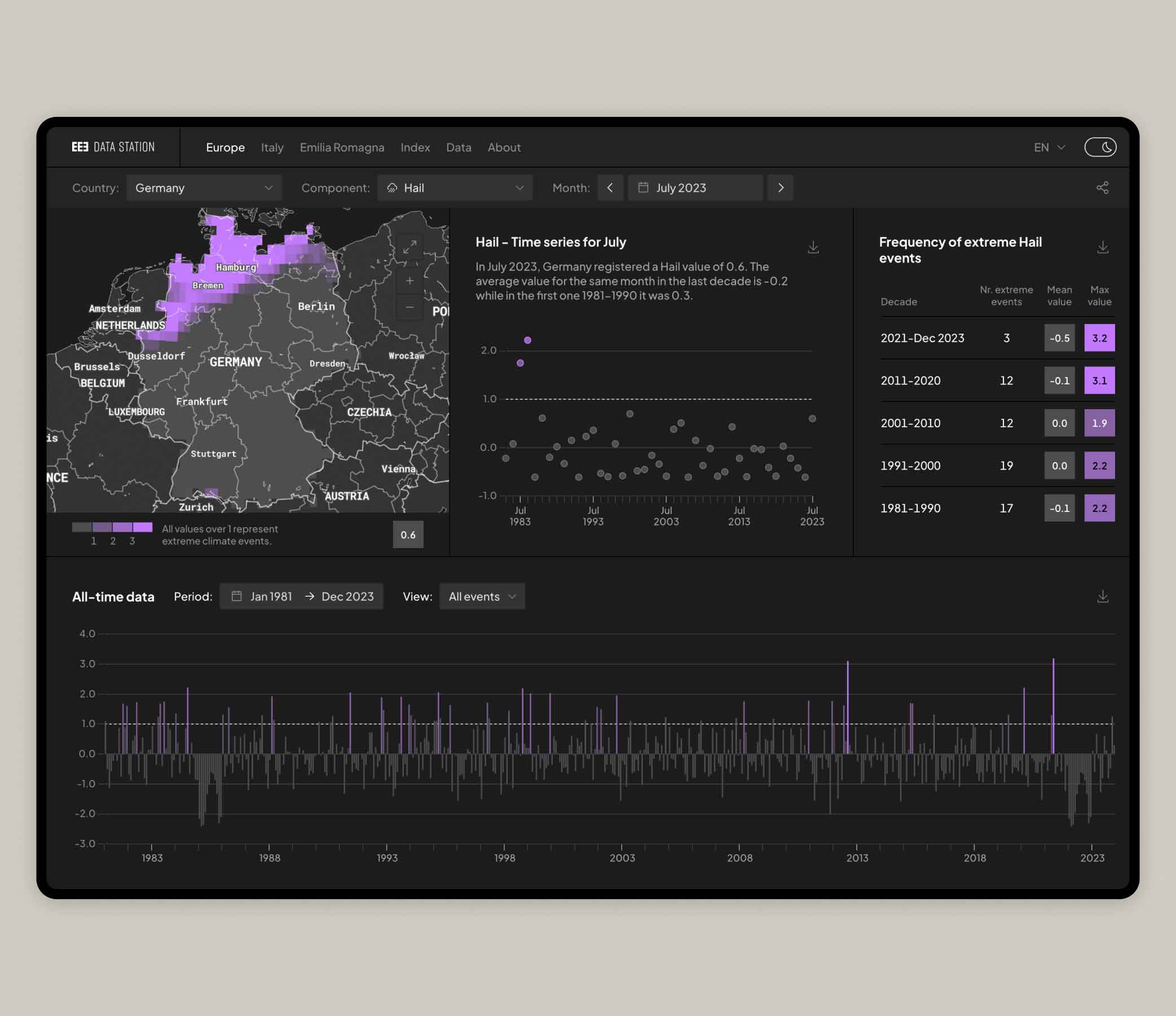
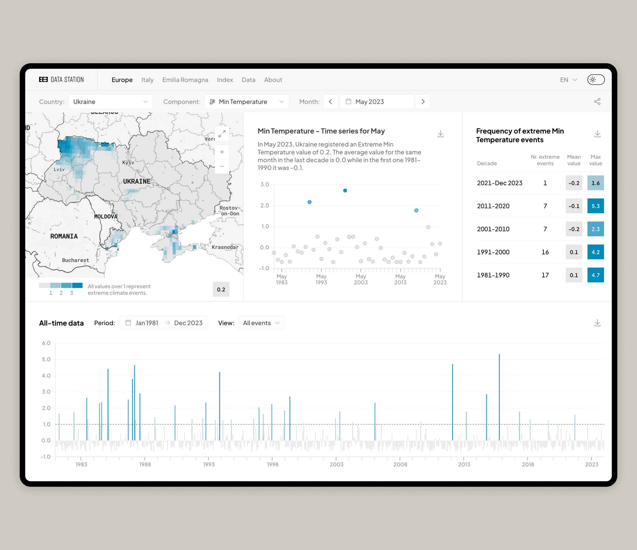
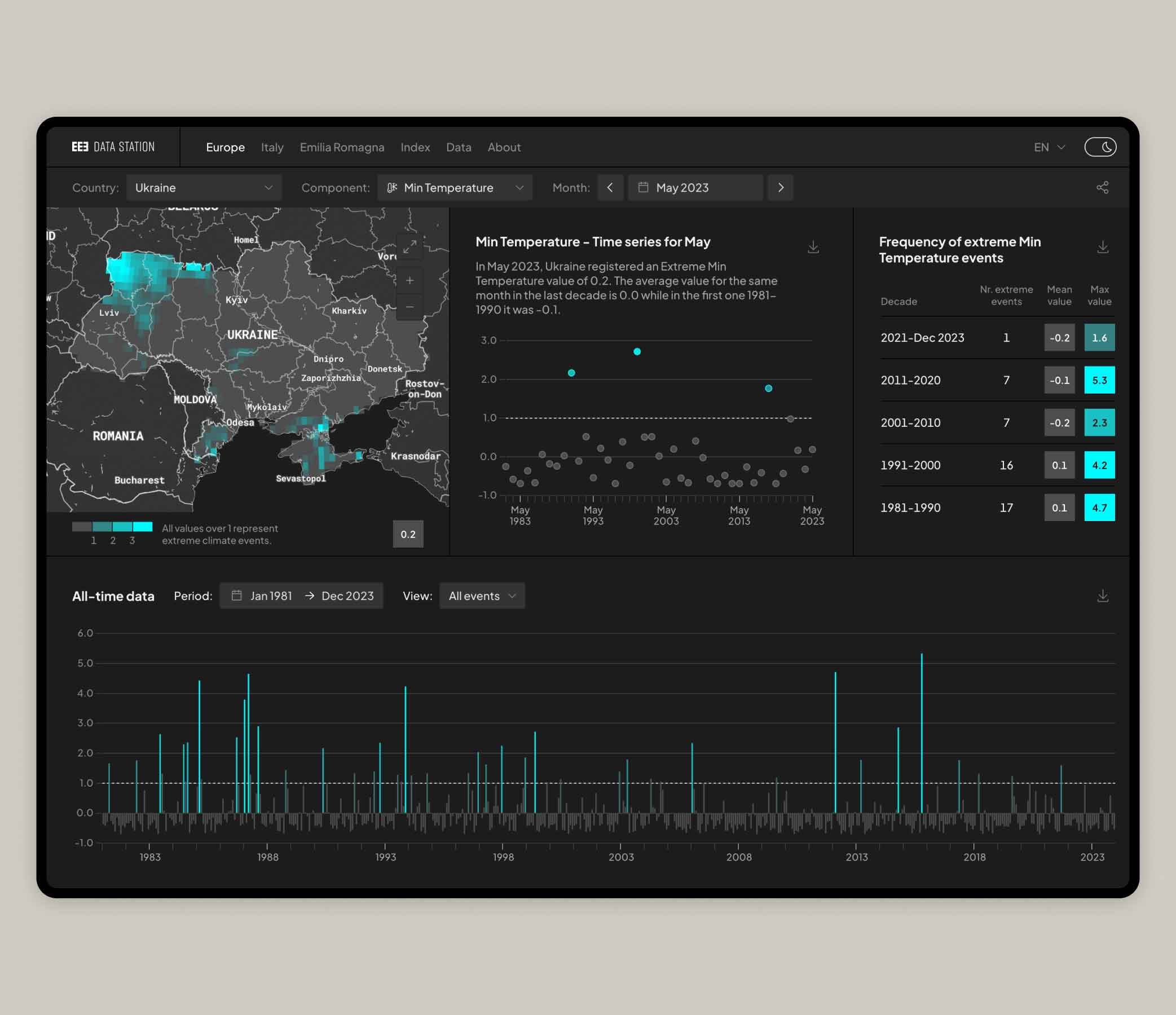
The dashboard
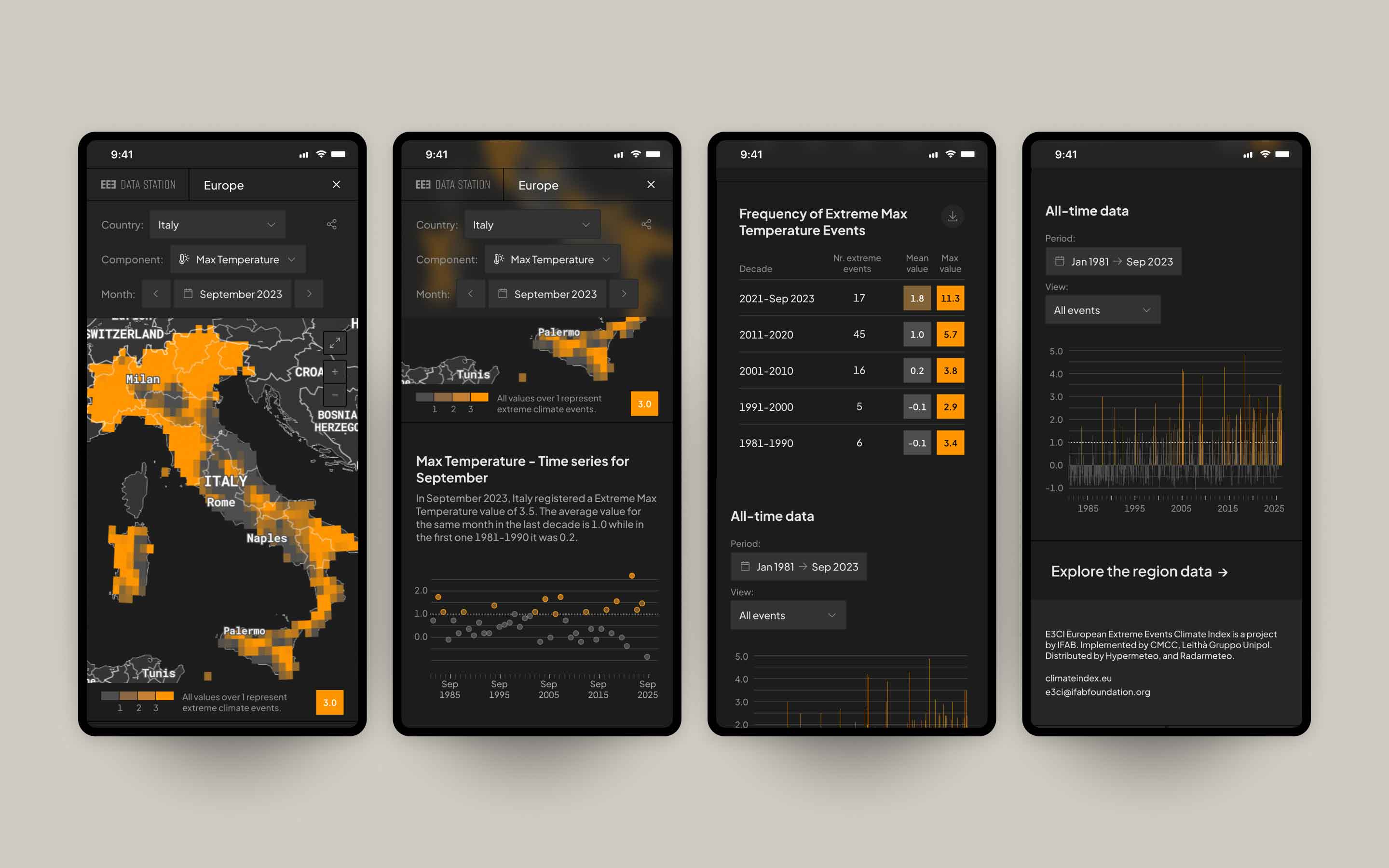
An interactive dashboard presents the latest data of each administrative unit
(nation/region/province) through different visual models: a map, a plot chart, a table and a bar
chart. The varying shades of color and the size/position of each data point convey the intensity of
weather events, providing a comprehensive and visually engaging overview.
Users can:
- download the data (filtered on the selected country and component)
- download the separate charts and maps as .jpg files
- embed the dashboard view on other blog or web pages
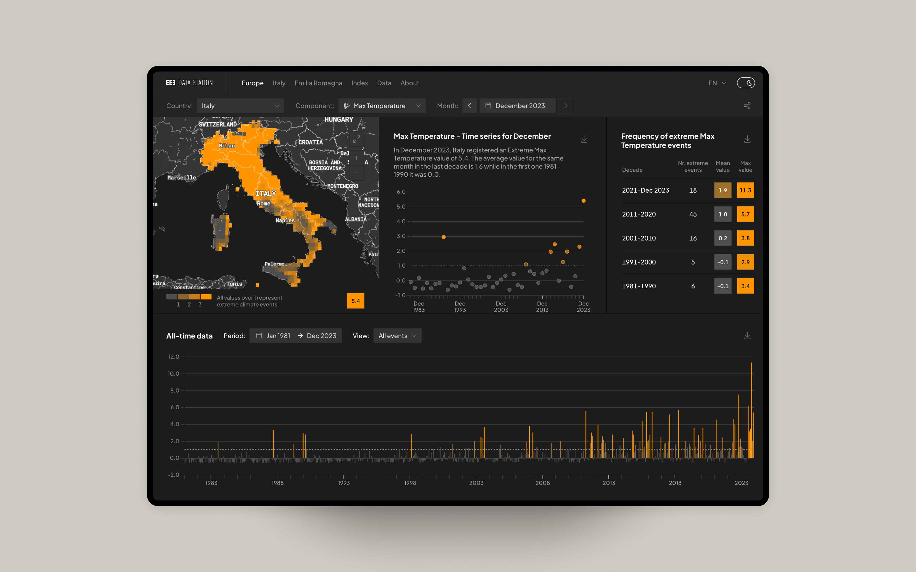
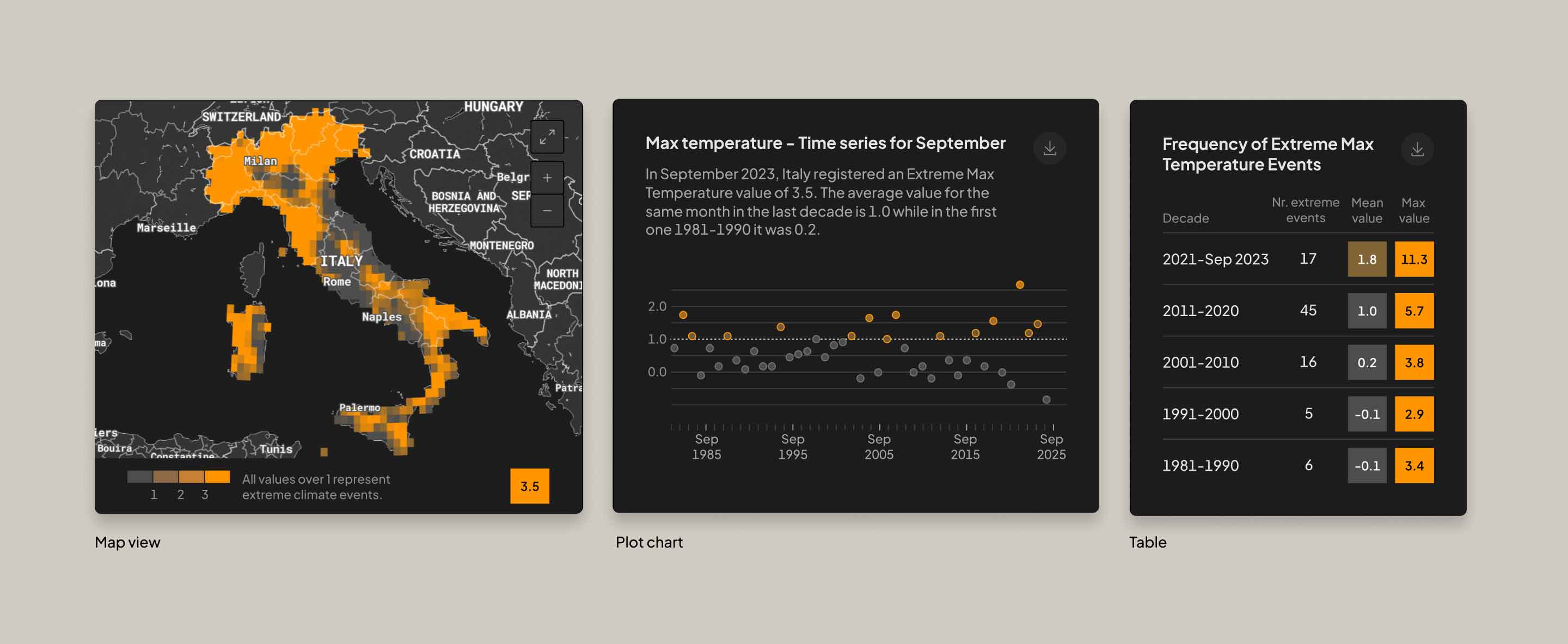
The upper section of the dashboard features a map illustrating the areas affected by extreme weather events, adapting based on the selected component and time period. Additionally, a plot chart facilitates the comparison of values for the same month over time, while a table lists the frequency of extreme-only weather events.
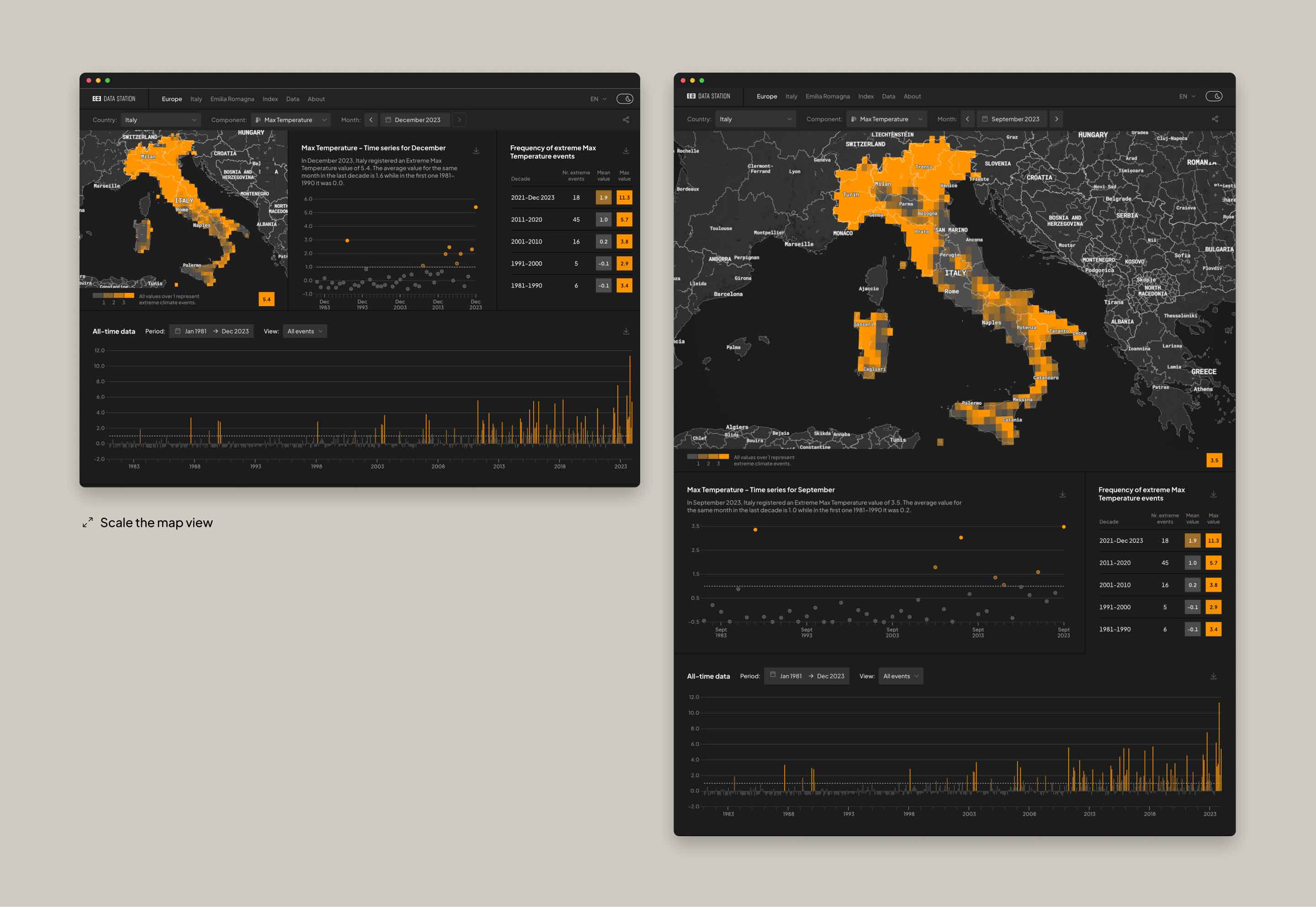
The map view can be scaled to download images at higher resolution.
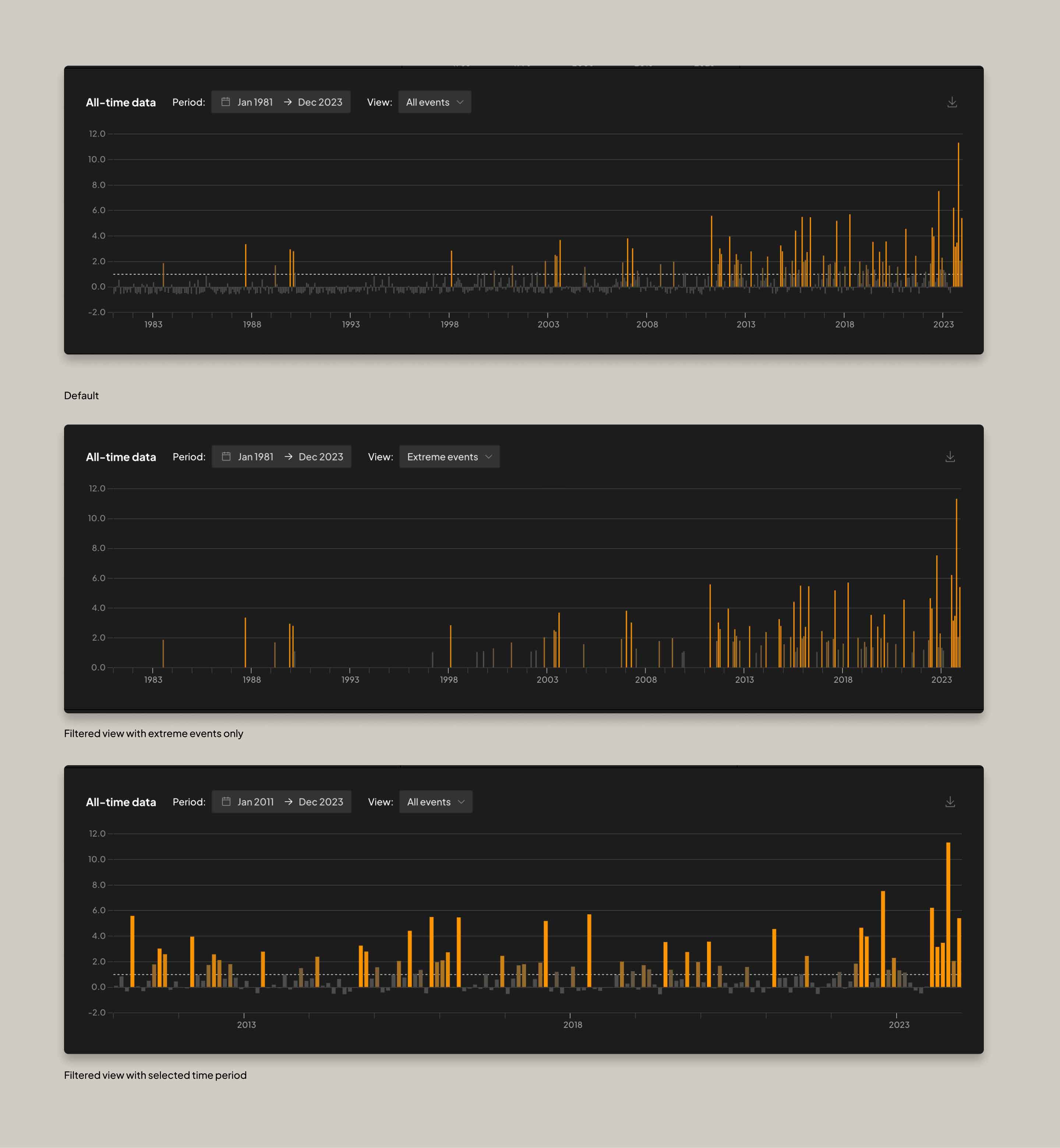
At the lower section, an interactive bar chart presents historical data, which can be filtered by selecting a specific time period or visualising only the extreme weather events.
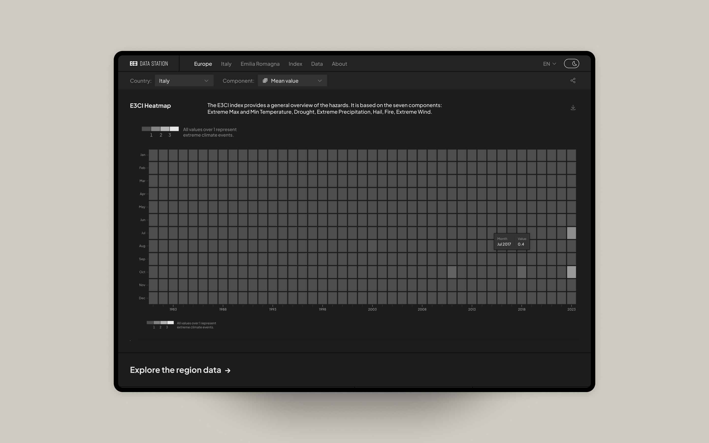
Mean Value
The index provides a general overview of the hazards by calculating the Mean Value of the seven
components. Represented as shades of grey, it is not based on geographical data.
Comparing extreme events
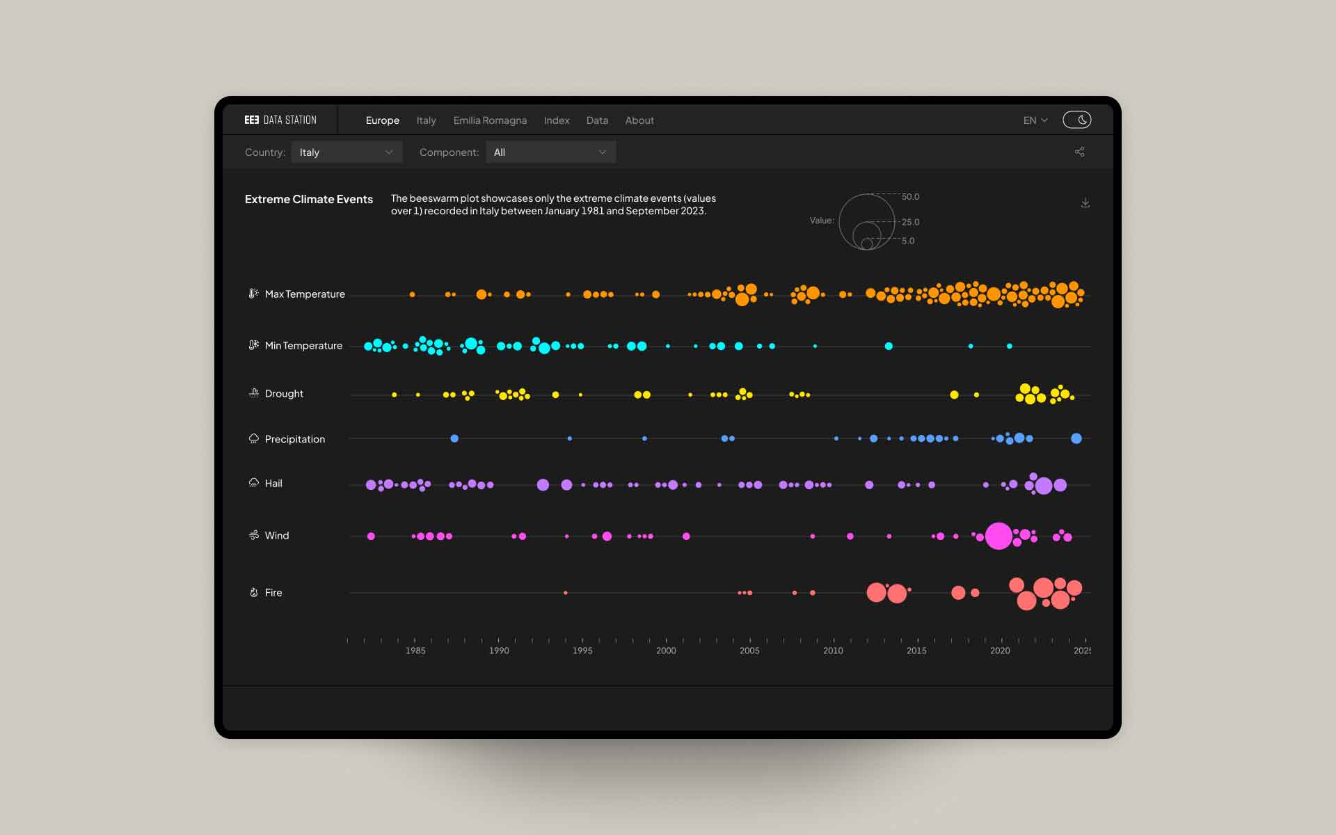
For each administrative unit, it is possible to compare the seven components through a bee swarm
plot. The chart shows only the extreme weather events arranged in chronological order, with varying
circle sizes based on thier intensities.
Light and Dark Mode
The platform is available with a light and dark theme that switches automatically based on user
preferences, ensuring optimal readability in all lighting conditions.

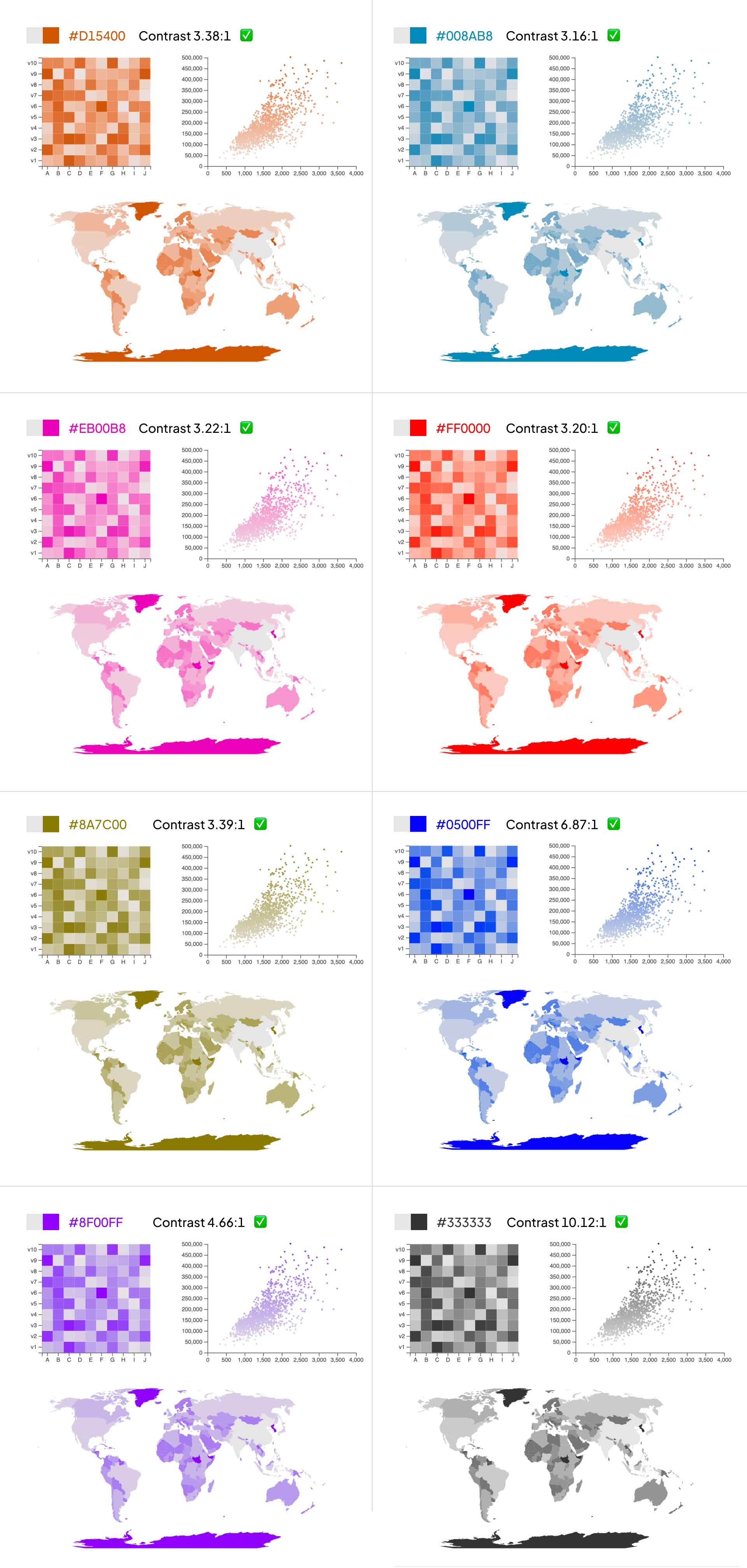
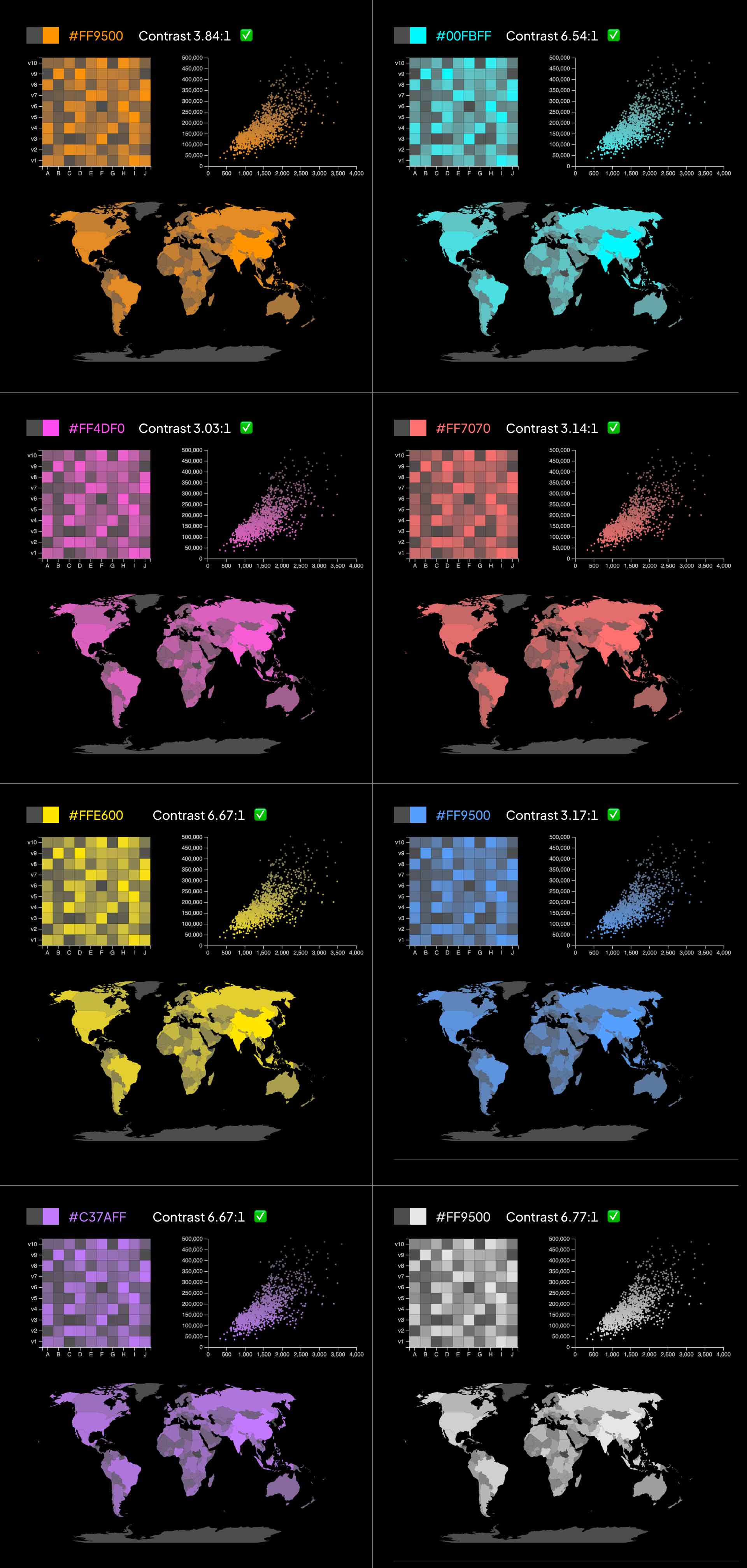
Use of colours in weather visualisations
When comparing climate maps and charts from reputable sources (such as space agencies like ESA and
NASA, or news media like BBC, Reuters, The New York Times, etc.), it becomes evident that there is a
lack of standard rules for weather representations. Common practices like using a divergent color
bar (from hue A to B) or a rainbow colour scale (with 7 or more hues) persist, despite causing
perceptual issues for people with visual impairments.
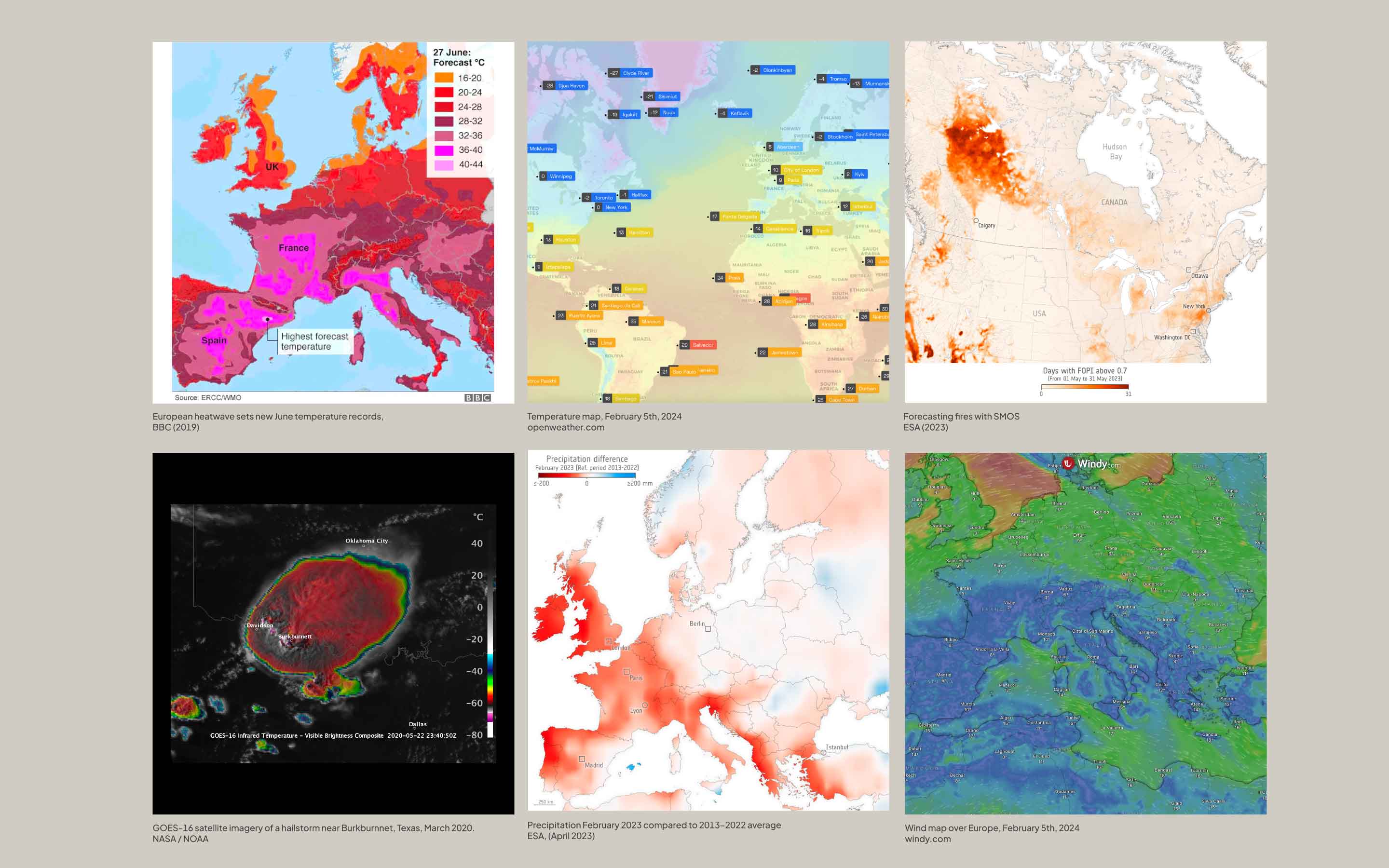
The design of the data station highlights data through the use of color and charts. Given that climate events are classified as extreme when their value exceeds 1, using a continuous color range establishes a clear hierarchy based on the intensity of weather events. Additionally, each colour has been assessed with web accessibility tools to ensure readability in both Light and Dark themes.

Technical insights
Efficiently navigating between months and countries is a key element of the user experience on the
website. However, employing on-the-fly data filtering for each request would have posed challenges
due to its slowness and resource-intensive nature. To address this, a custom backend has been
developed to generate and locally cache 3GB (and counting) of JSON files, ensuring swift access to
monthly data across Europe.
Mapbox was adopted for all map-related requirements thanks to its versatility, ease of use, and
theming abilities. Instead of loading a new map for each page, which would have been expensive in
terms of cost per view and performance, the same instance is shared across the website as much as
possible by leveraging the templating flexibility of Nuxt 3. While the initial page load involves
processing considerable JavaScript, subsequent pages demand minimal data to be rendered.
Credits
E3CI is a project by IFAB (International Foundation Big Data and Artificial Intelligence for Human
Development). Implemented by Euro-Mediterranean Center on Climate Change (CMCC), Leithà Gruppo
Unipol. Distributed by Hypermeteo, and Radarmeteo.
datastation.climateindex.eu
UX/UI design, data visualisation: Cinzia Bongino, with the supervision of climate data scientist
Federica Guerrini
Development: A. Arlandi
climateindex.eu
Design and development: Tracce
Year
2024
Fun fact
This project was born during a 24-hour hackathon in January 2023. Check the original idea here ↗.